4AM
The principal aim of this project was to create a new brand for a new audience of corporations and startups. Innovation was the key idea for this rebranding project as well as a strong visual identity circling around the idea of time and space.
Innovation as the intersection of time and space.
BRIEF
4AM is a venture by Ernst and Young, one of the Big Four accounting firms. EY’s vision was to empower its innovative muscle, gathering a team dedicated to helping businesses embrace newness and change as part of their drivers for growth. Run by a team of entrepreneurs and future oriented leaders at EY, 4AM looks to push the boundaries working with transformative business models. EY entrusted Erretres to build its new brand for an audience of innovative corporations and startups.
STRATEGY
Working closely with the 4AM team and conducting extensive research, Erretres identified the key concepts that represents the brand’s values and ambitions, both independent and as part of EY’s firm. With EY’s tagline as “building a better working world”, Erretres developed a creative concept for 4AM as a play on the tagline but refined for a more targeted audience: Impact Beyond Innovation. The goal was to make sure the prospective clients of 4AM identify with their future-oriented and disruptive thinking of its team.
CONCEPT
With innovation as the intersection of time and space, 4AM’s aim of bringing about tangible business transformation was incorporated within its tone of voice and visual identity. Like the exploration of space, 4AM’s team envision opportunities which are at light-year’s distance away, represented by shapes that come into focus as the explorers approach them. Once the innovation opportunity is defined, 4AM’s team moves fast to the future.
LOGO
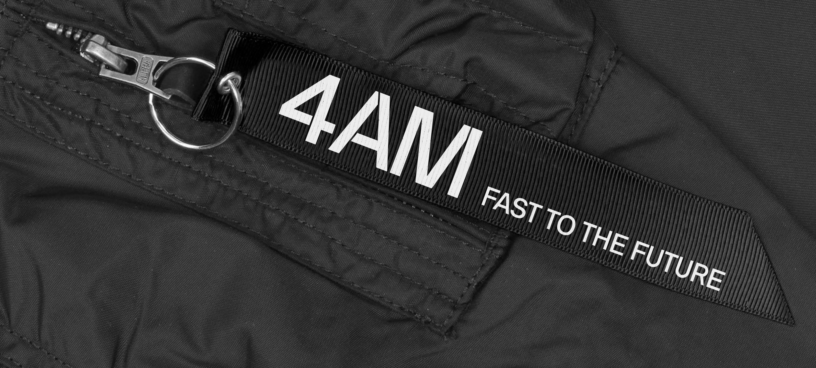
The logo for 4AM had to be simple and yet convey the brand idea. The strokes that form the text of the name were inspired by the hands of a clock. The video visualises these strokes coming together to reveal the logo for 4AM.
VISUAL IDENTITY
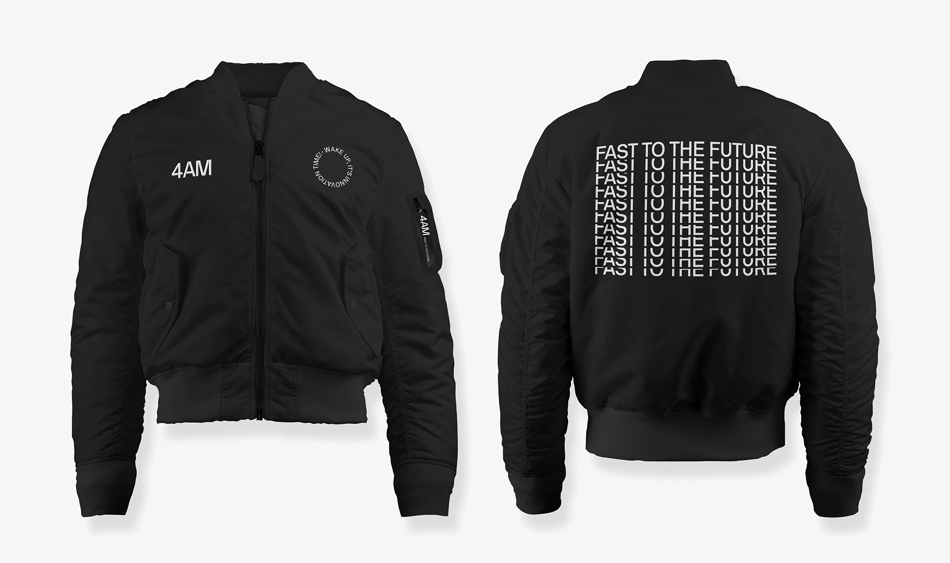
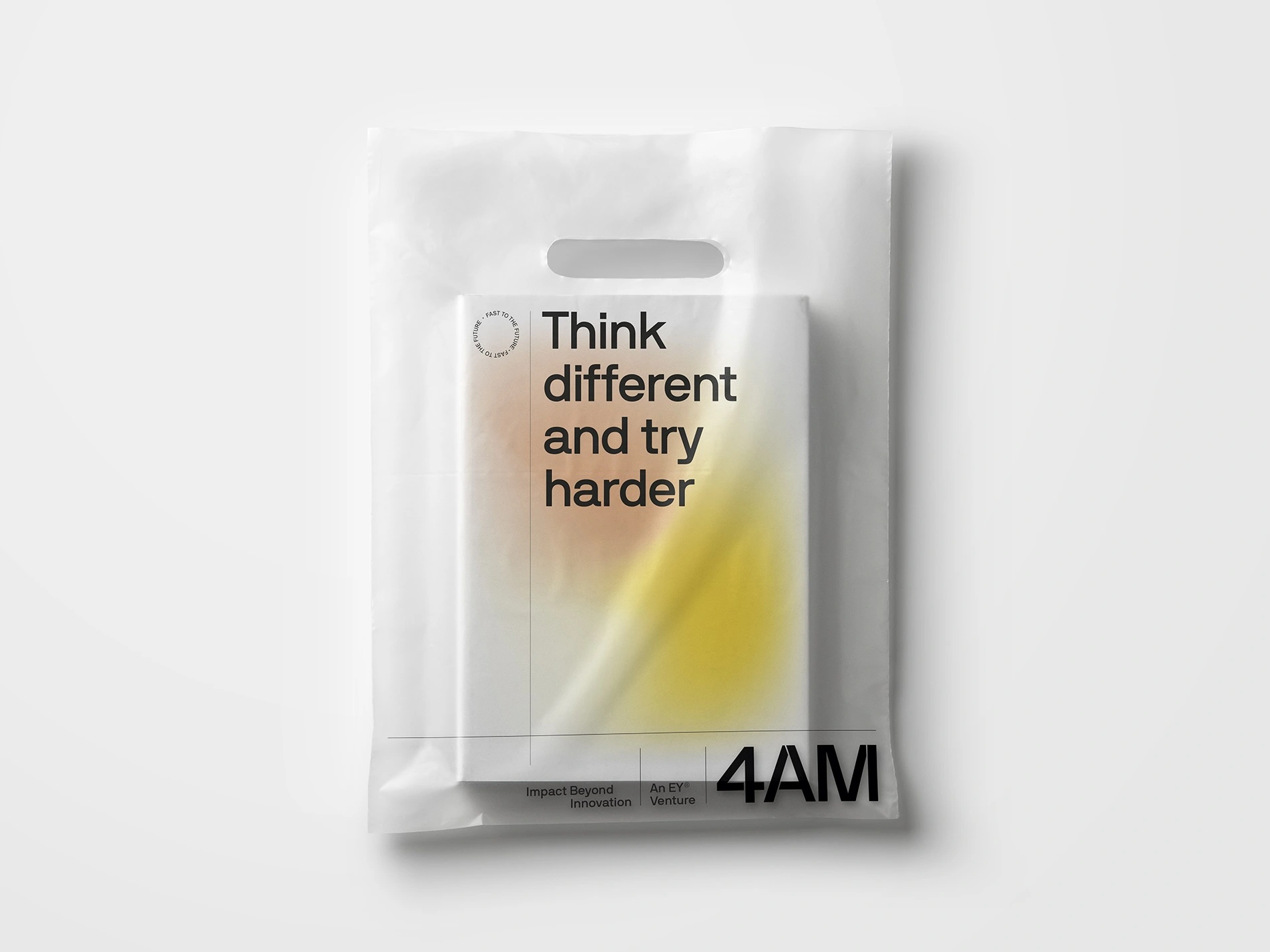
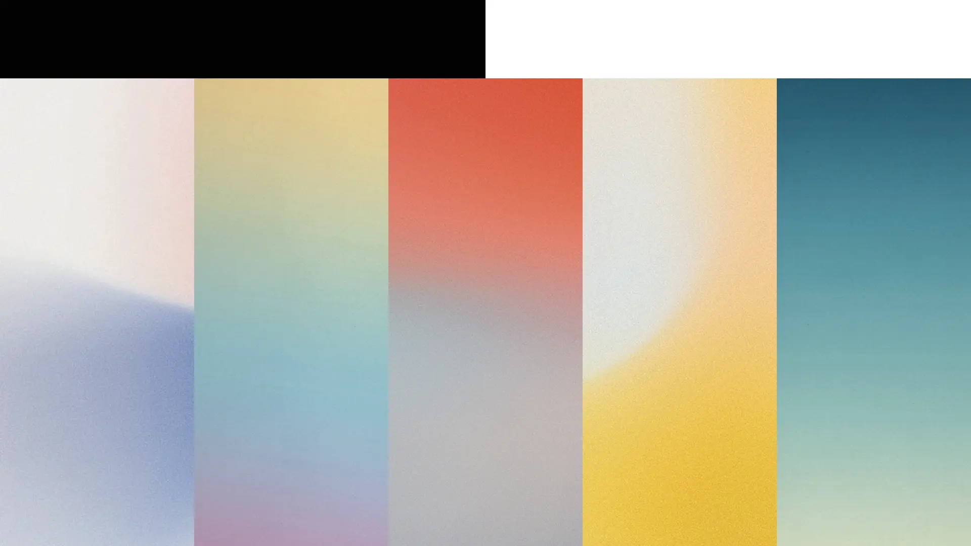
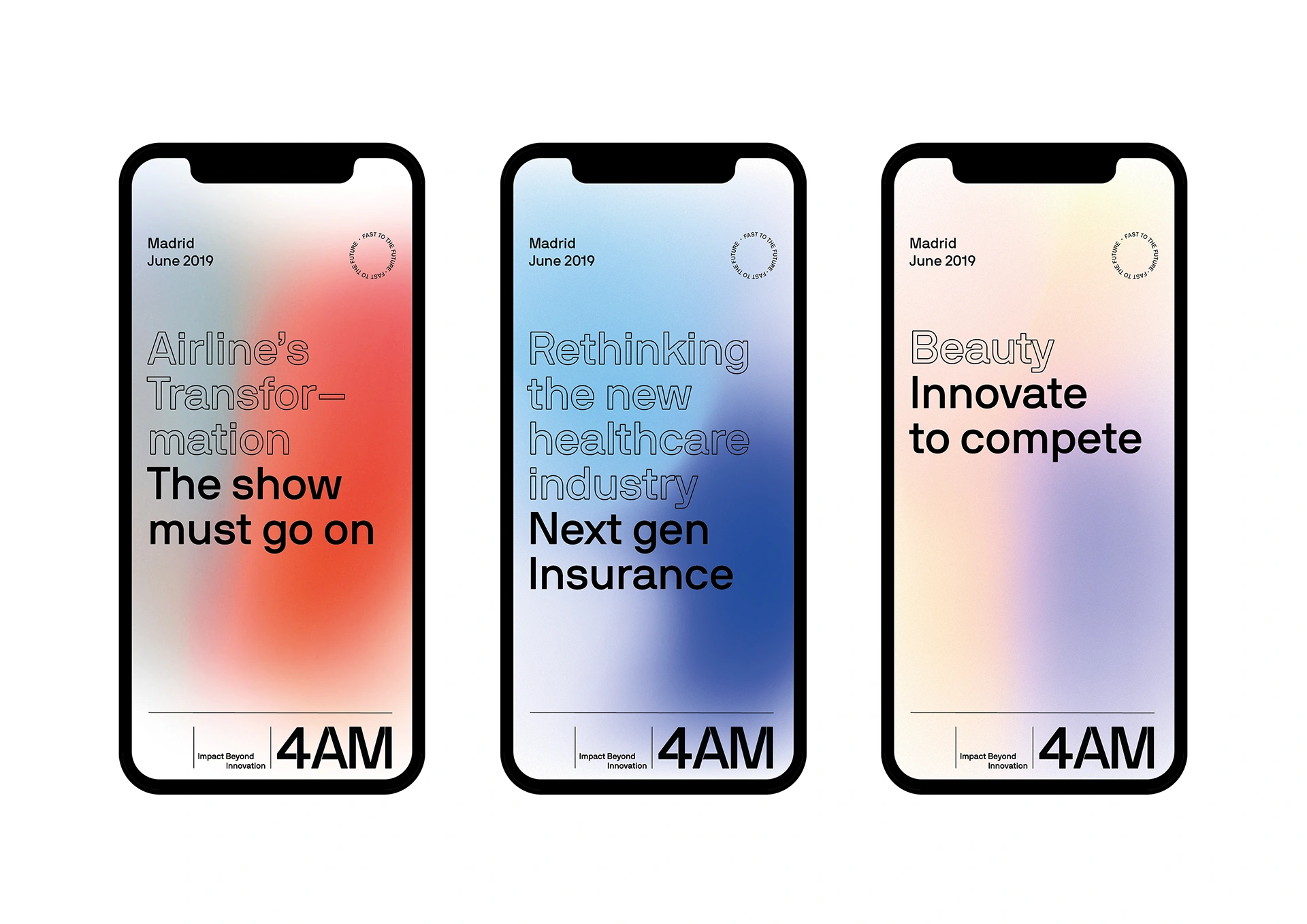
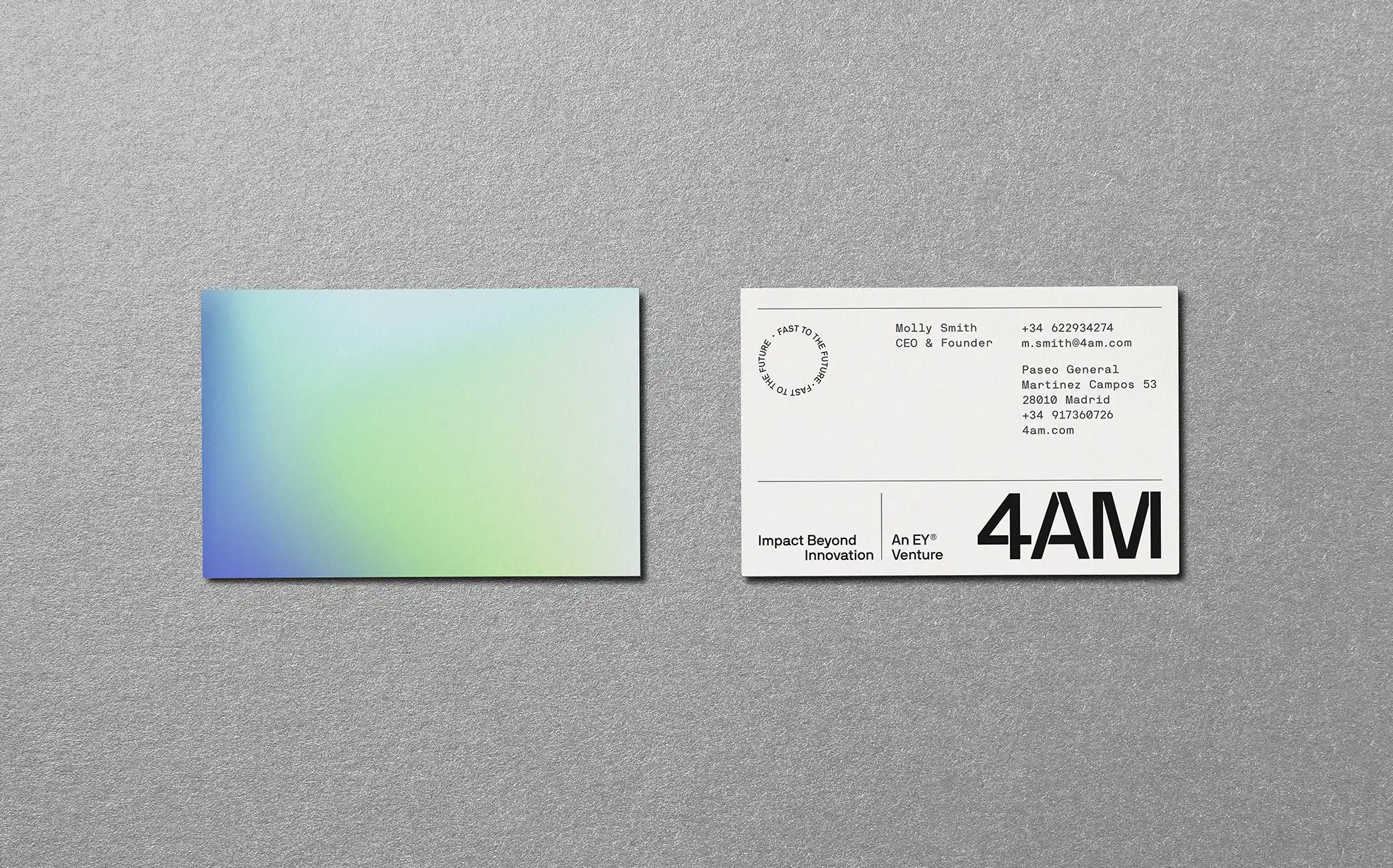
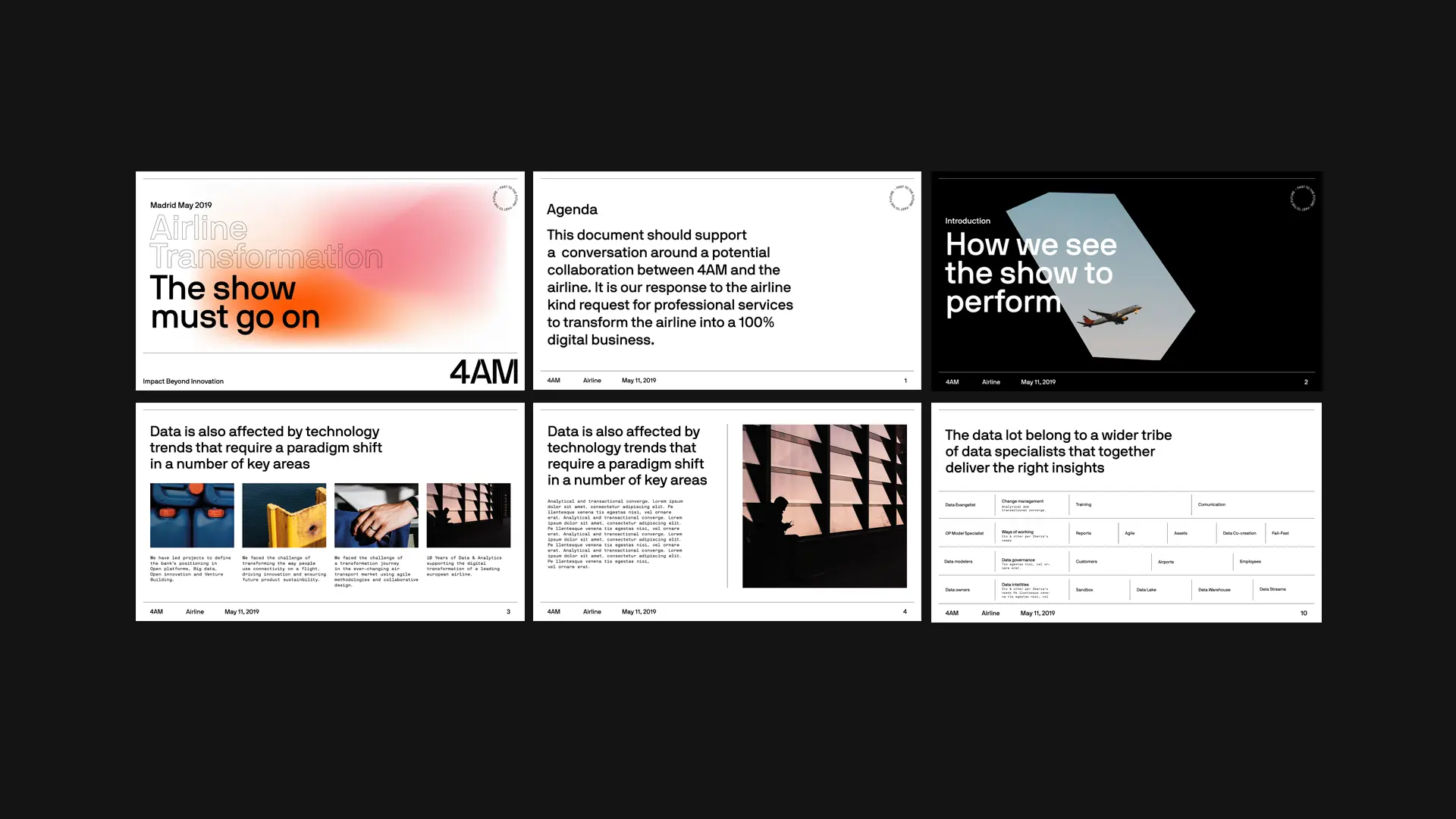
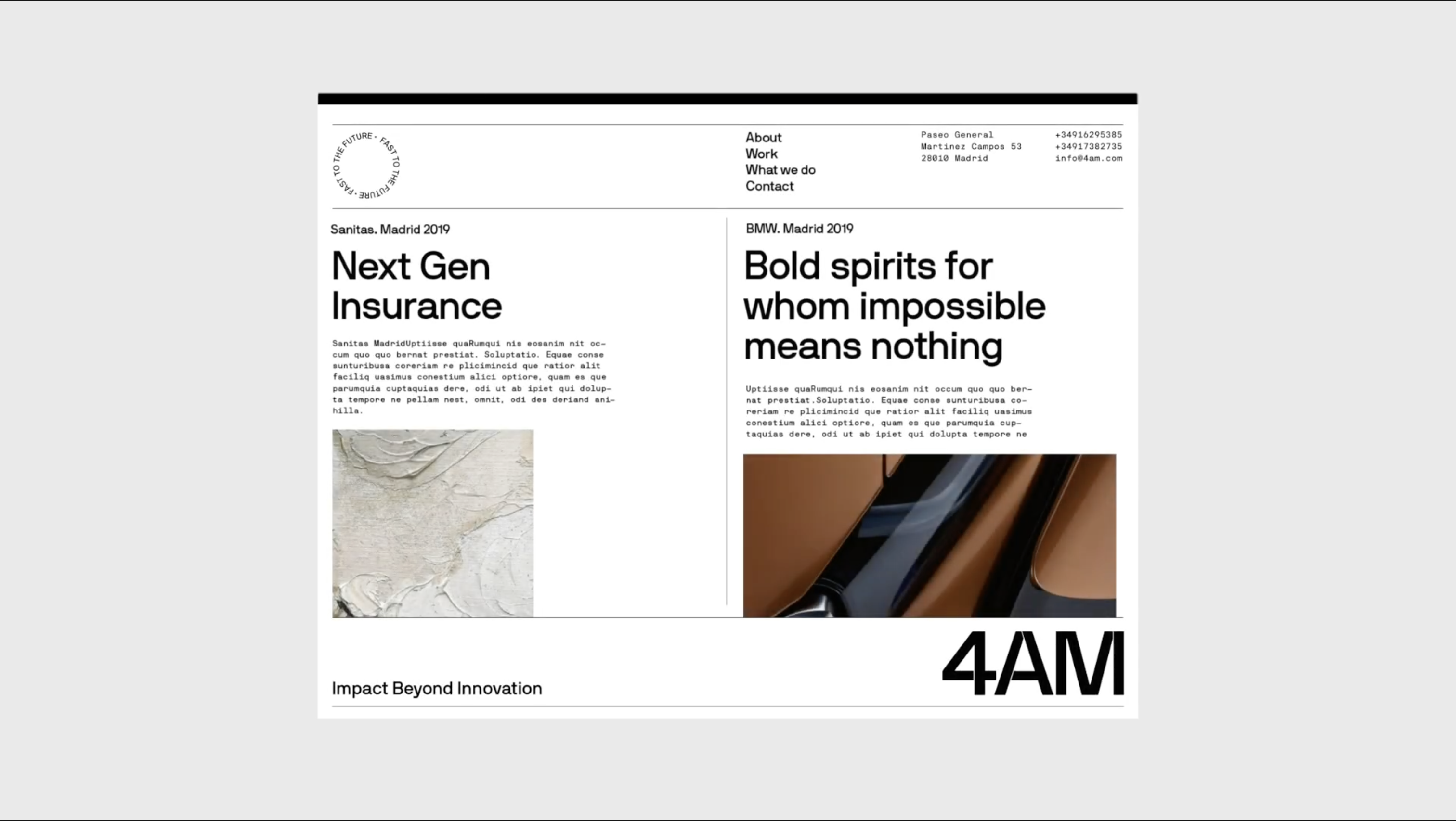
To visualise the brand, we developed two design elements: shapes (in their various stages of definition), and a strong use of type to express speed and authority. For the photographic style, the gradient, and the grain effect symbolise the marriage of digital and analog.
TOUCHPOINTS
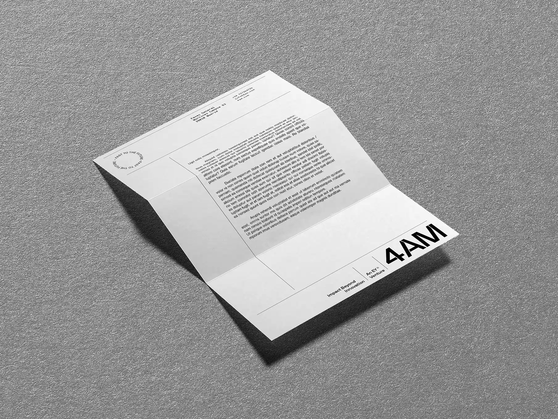
The identity created was meant to be versatile for different scenarios, both physical and digital. The graphic elements are combined to express the brand’s personality and transfer meaning through design across all touchpoints.
Enjoying this project?
As a strategic brand, design, and digital consultancy, at Erretres we’ve developed international projects for sectors such as media, sports, tech, startups, tourism, travel, fashion, gastronomy, real estate, and hospitality.