Banco Pichincha
This centenary bank entrusted us to reinvent their brand identity making way for a modernized image. The new attributes we came up with were based on the concepts of inclusivity and development. As well as the brand identity the visual identity needed to be adapted to the digital context by adjusting the original monogram the logo was based on.
Forseeing the path of the first bank in Latam.
Banco Pichincha, with more than 112 years of history, is Ecuador’s biggest bank which also has a presence in Peru, Colombia, Spain, the USA and Panama. Throughout these years they have dedicated their work to the sustainable and responsible development of the Andean region and its inhabitants. The old brand, unchanged for almost a century, has given way to a renovated image, a symbol for new era of transformation and innovation. Erretres was chosen as the agency to realise the brand’s evolution after a successful bidding process in which other large international agencies participated.
STRATEGY
The project began in 2015, starting with research and analysis of the bank, with numerous research trips and meetings with managers from various departments. This aimed to develop a brand strategy which would work across the different countries in which the bank works, given that each market has different business practices and distinct clientele.
At the end of the process, a new brand positioning and brand attributes were defined. The brand’s historical name was also addressed (Banco Pichincha, previously Banco del Pichincha), which is associated with the volcano and the region of the same name. This region holds Ecuador’s capital Quito, and also lends its name to the battle during which Ecuador proclaimed its independence.
SHARING
THE CONCEPT
THE CONCEPT
The brand’s original symbol was a monogram which had been used for decades, and so was becoming antiquated and suffering problems with legibility and adaptability to digital media.
Based on the attributes defined during the strategic phase of the project, the idea arose of creating a new symbol to represent the close relationship of trust between the bank and its people and their commitment to the region’s development, suggested by the upwards movement of the element within the symbol (the simplified expression of a rising arrow). Thanks to its reduction to a purely graphical essence, the symbol is perfectly adaptable to all kinds of formats and applications, as it is recognisable even in its most reduced form.
As such, the symbol’s inherent concept can be resumed as a secure space which welcomes the close and trusting relationship (suggested by the curved rectangle) between the bank and its users, propelling the development and prosperity of its people (the rising arrow represented by the straight shape in the upper right corner).
THE LOGO
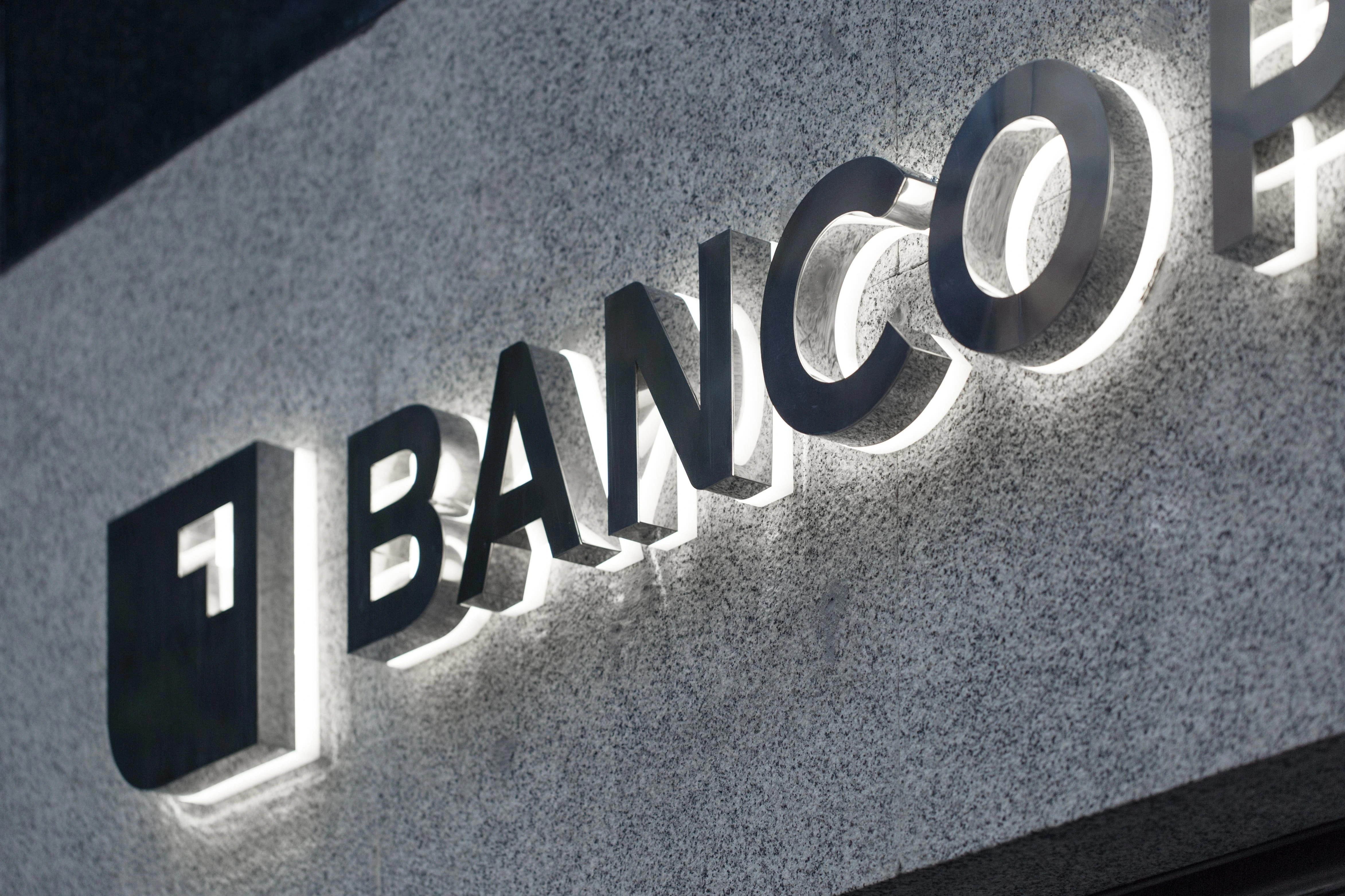
For the brand’s logo, a high quality custom logotype was designed, composed of the letters in an uppercase sans-serif typeface. Rounded edges were selectively added to evoke a friendly and warn sensation, as well as a more modern image.
TYPOGRAPHY
A contemporary and neutral type family was chosen as the corporate typeface, qualities which make it ideal for use across the numerous and diverse applications required by a bank, such as editorial work, signage, digital and other uses.
It is used in its two variations: slab (with a strong character for a unique and recognisable identity) and sans-serif (for optimal legibility and use in digital environments), all in order to organise the typographical hierarchy according to the uses required.
COLOURS
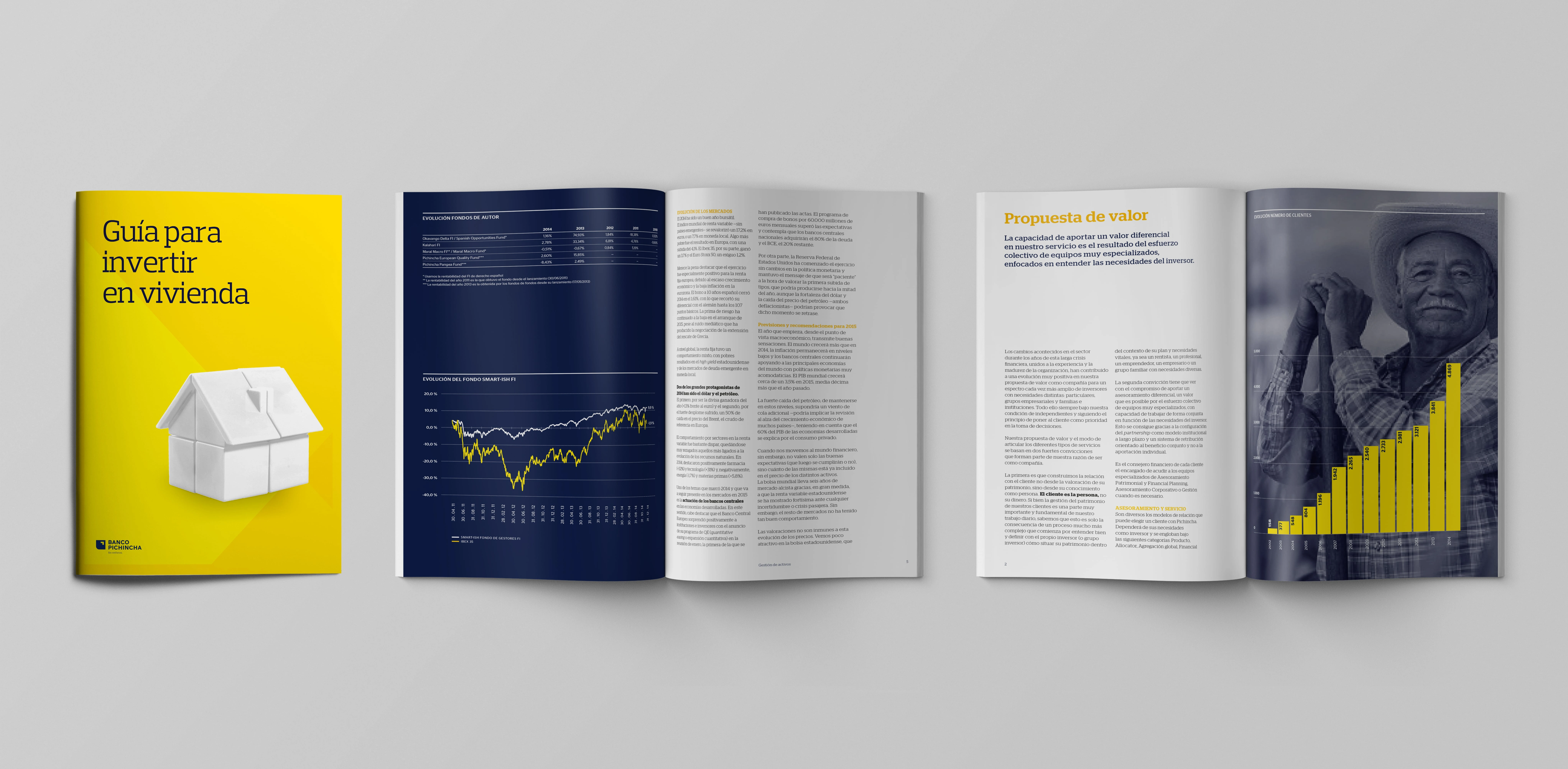
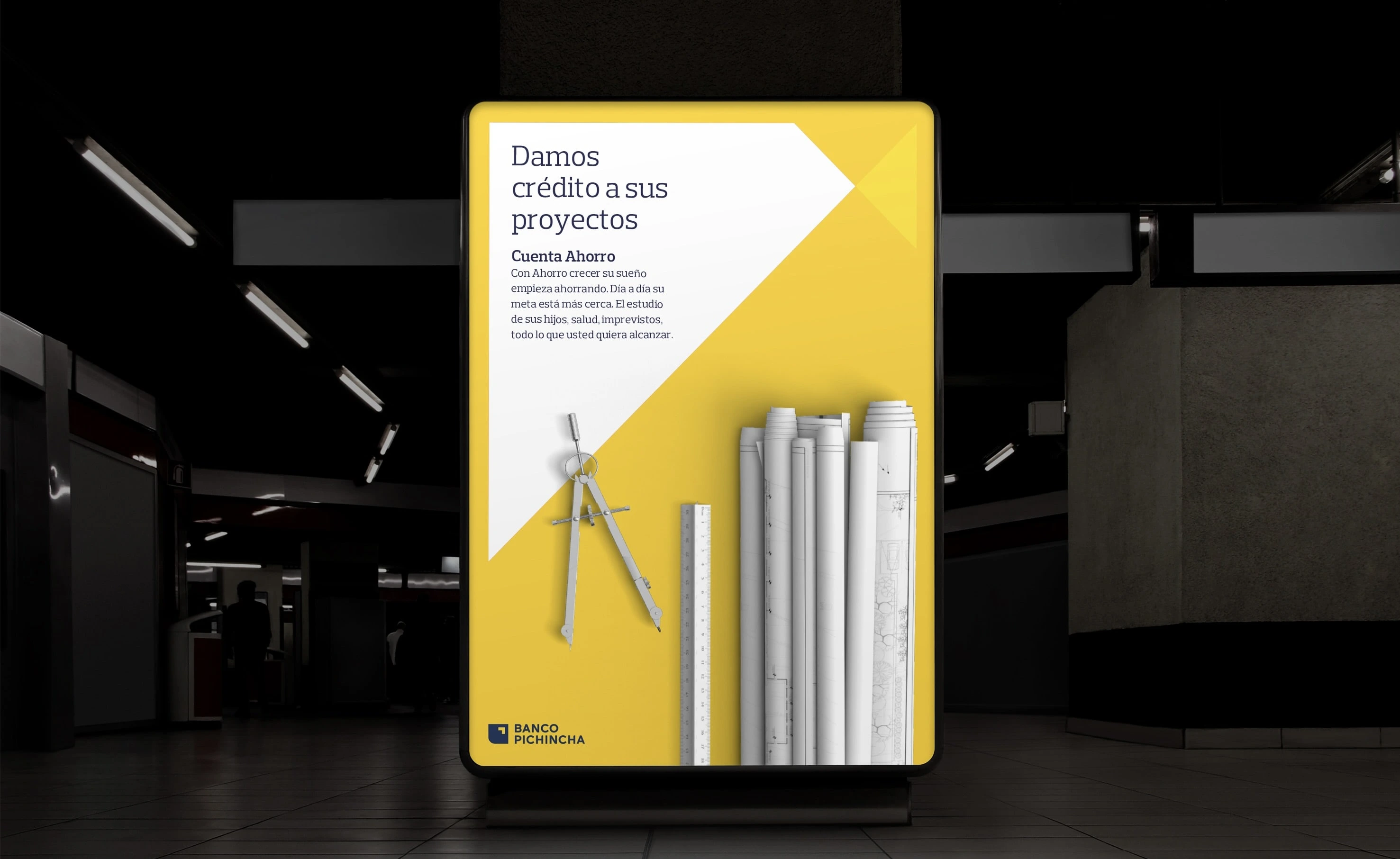
From the beginning, intuition dictated that yellow should be maintained as the bank’s principal colour to conserve the brand’s legacy, and also because it is highly differential within the sector. Yellow is also present in the majority of the country flags of the Andean region, and holds positive connotations as a symbol of positivity, happiness, light (the sun’s rays are perpendicular on the equator), and prosperity, amongst others. A brighter and fresher tone of yellow was chosen in order to rejuvenate the brand, and it was combined with an elegant and modern navy blue (a new wink to the Ecuadorian flag) to substitute black, which contrasted too strongly with yellow.
PHOTOGRAPHIC STYLE AND ICONOGRAPHY
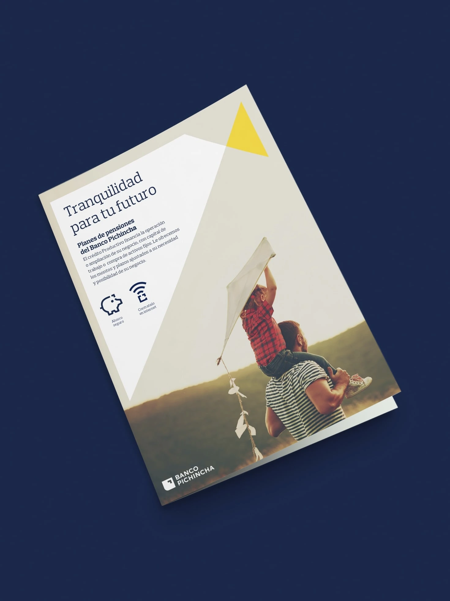
Keeping with the bank’s redefined personality, a new photographic style was established with which the bank wanted to make clear the pride it takes in aiding the personal development of its clients, from small local businesses to young entrepreneurs or private banking clients. Likewise, a custom icon style was designed whose construction is a nod to the arrow within the bank’s symbol, and which work perfectly in both physical and digital environments.
GRAPHIC ELEMENTS
In line with the bank’s positioning a grid was created which, though its graphic simplicity, symbolises two entities facing each other, in this case the sincere relationship between the bank and its clients. This relationship takes the shape of two triangles which meet and expand across a flexible graphic system, which is adaptable to different platforms and formats, and which acts as a container for images and text.
APPLICATIONS
An essential condition for the new identity which was clear from the start was that it should be able to perfectly adapt to all kinds of applications and media, especially digital, given that very soon it will be (and practically already is) the natural environment in which the brand works.
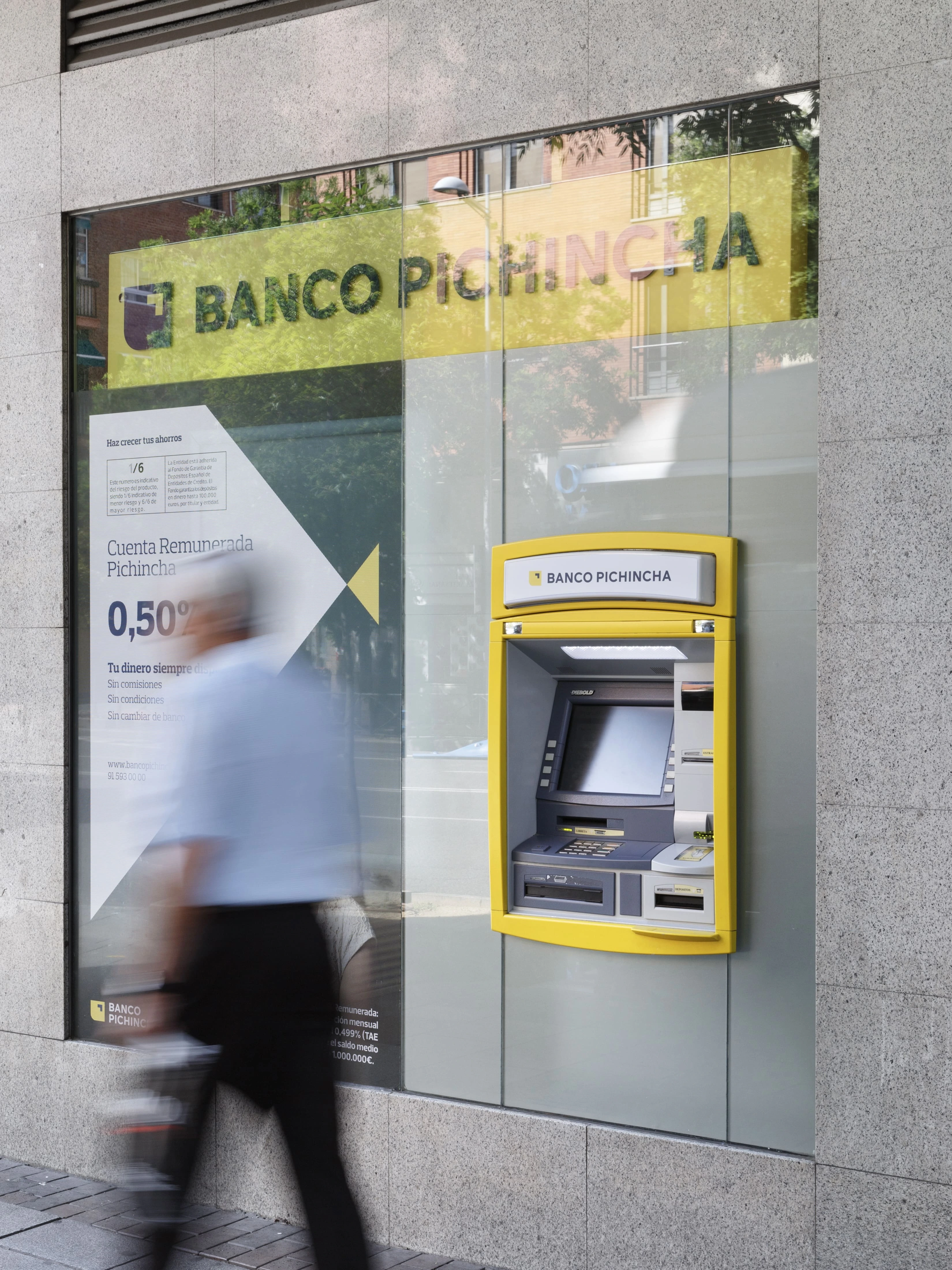
As such Erretres has designed an integral project, which ranges from the corporate stationary to numerous contact points, including the design of the signage for the office façades, interior wayfinding, cash machines and their screens, credit cards, chequebooks, welcome packs, ID badges, bank statements, corporate publications, brand application on the website and mobile app, newsletters, formats for social media, corporate videos, online and offline publicity, head offices, and much more.
For many of these applications, local adaptations had to be made in order to tend to the specific needs of each country in which the bank has a presence (Ecuador, Peru, Colombia, Spain, the USA and Panama).
Enjoying this project?
As a strategic brand, design, and digital consultancy, at Erretres we’ve developed international projects for sectors such as media, sports, tech, startups, tourism, travel, fashion, gastronomy, real estate, and hospitality.
RETAIL
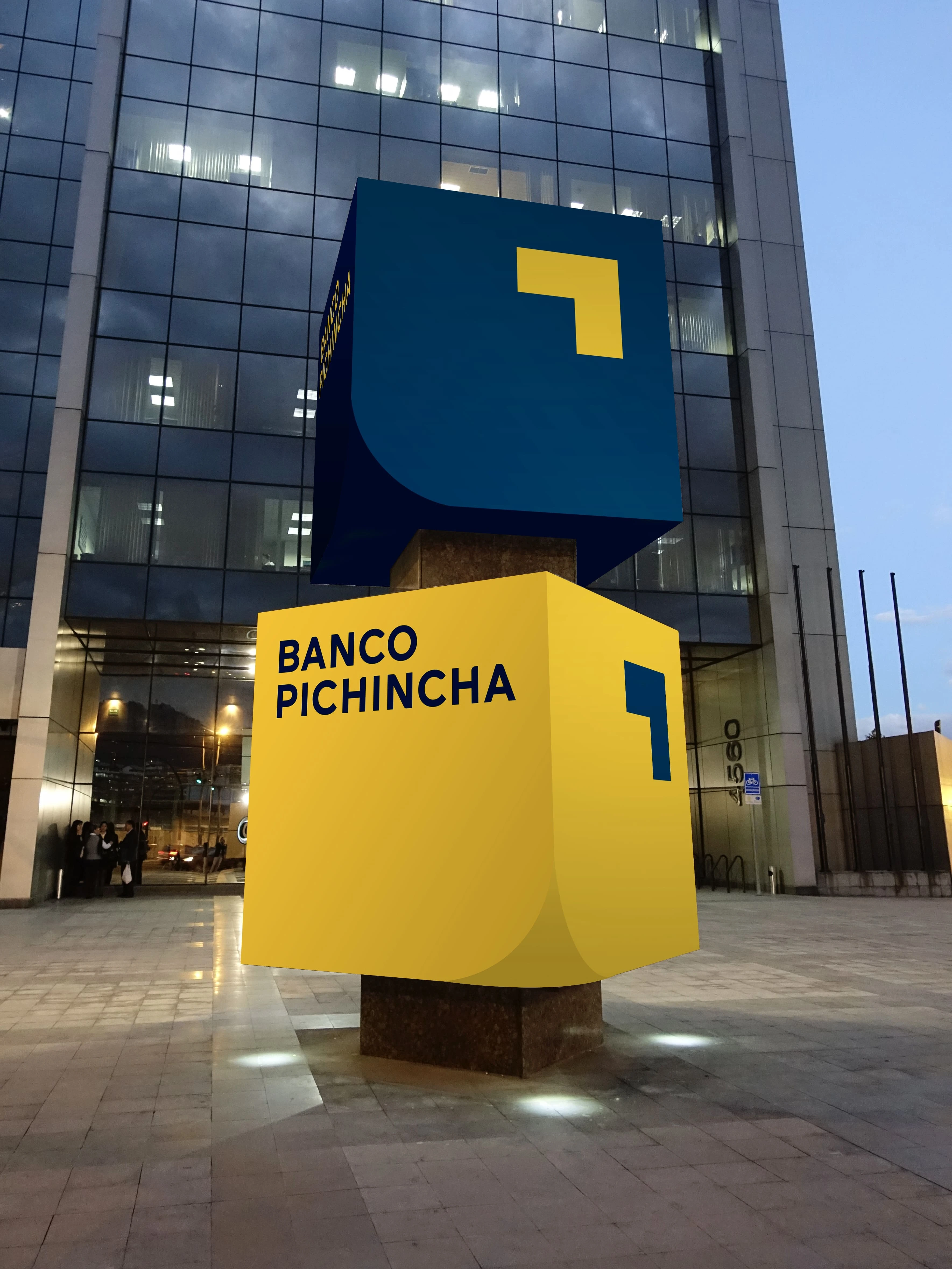
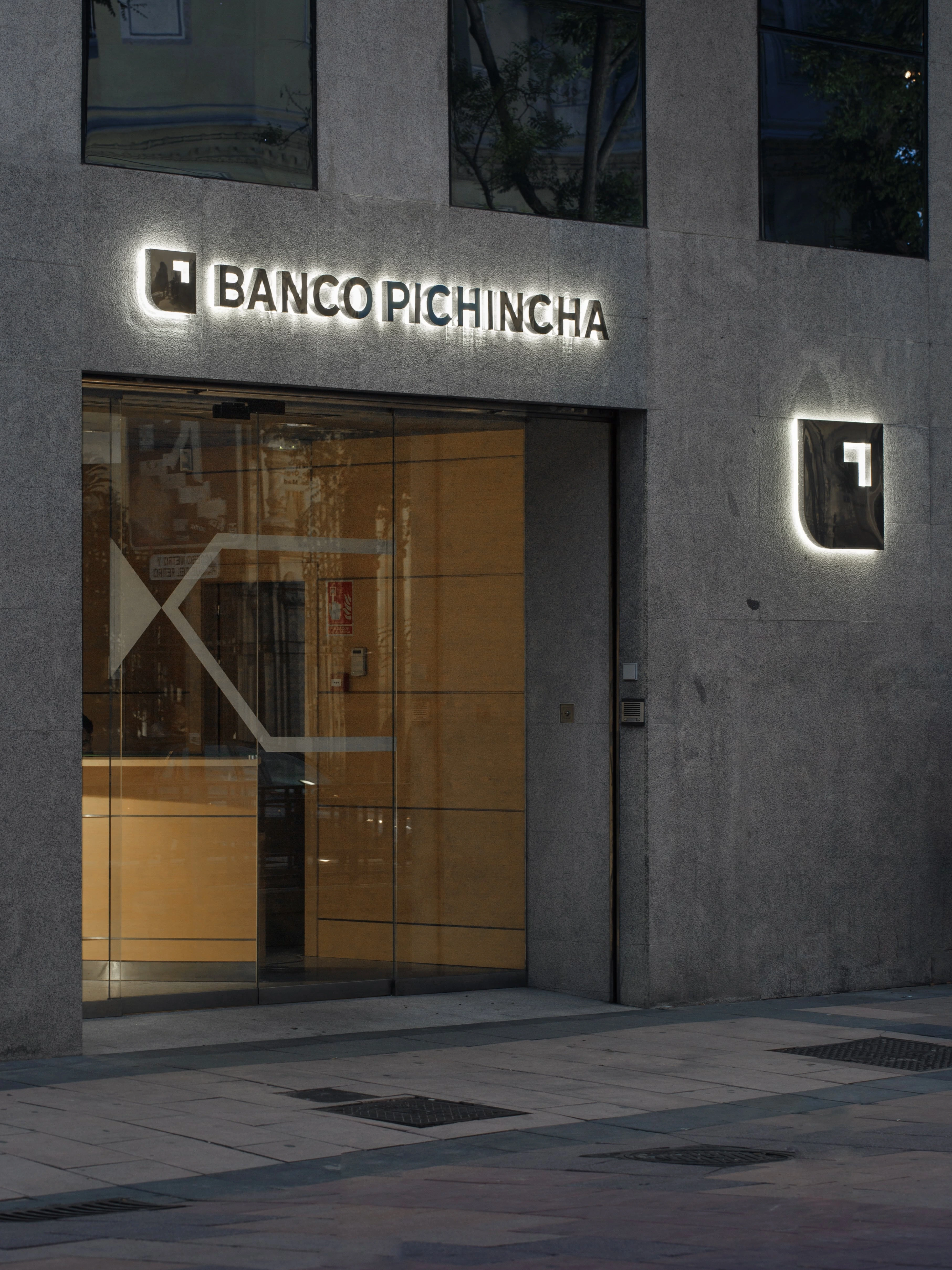
A fundamental part of the project consisted of designing the most important application of the brand in their branches and offices: façade signage, totems, banners, plaques, informative vinyl overlays, window signage, cash machine, internal signage, etcetera.