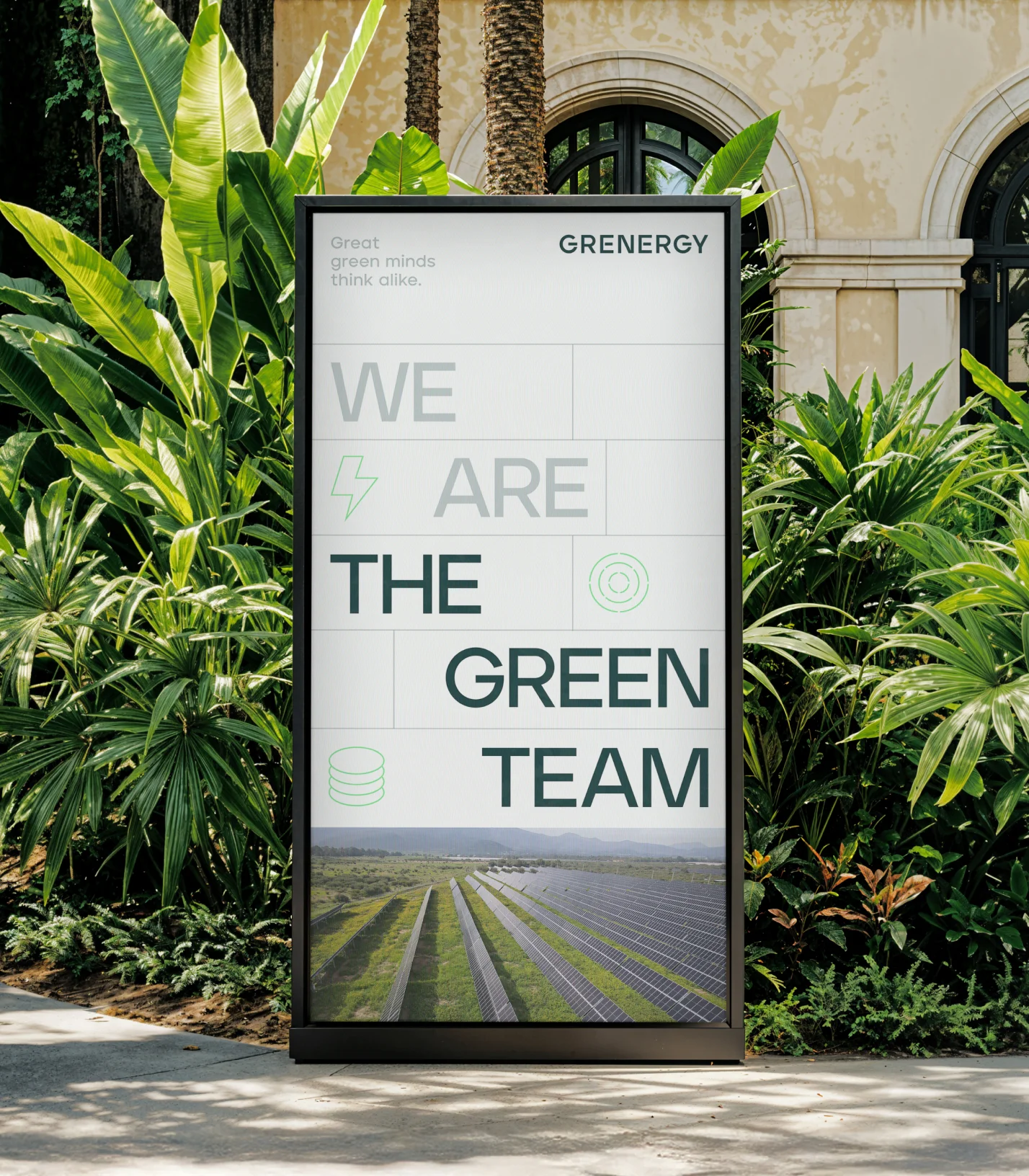
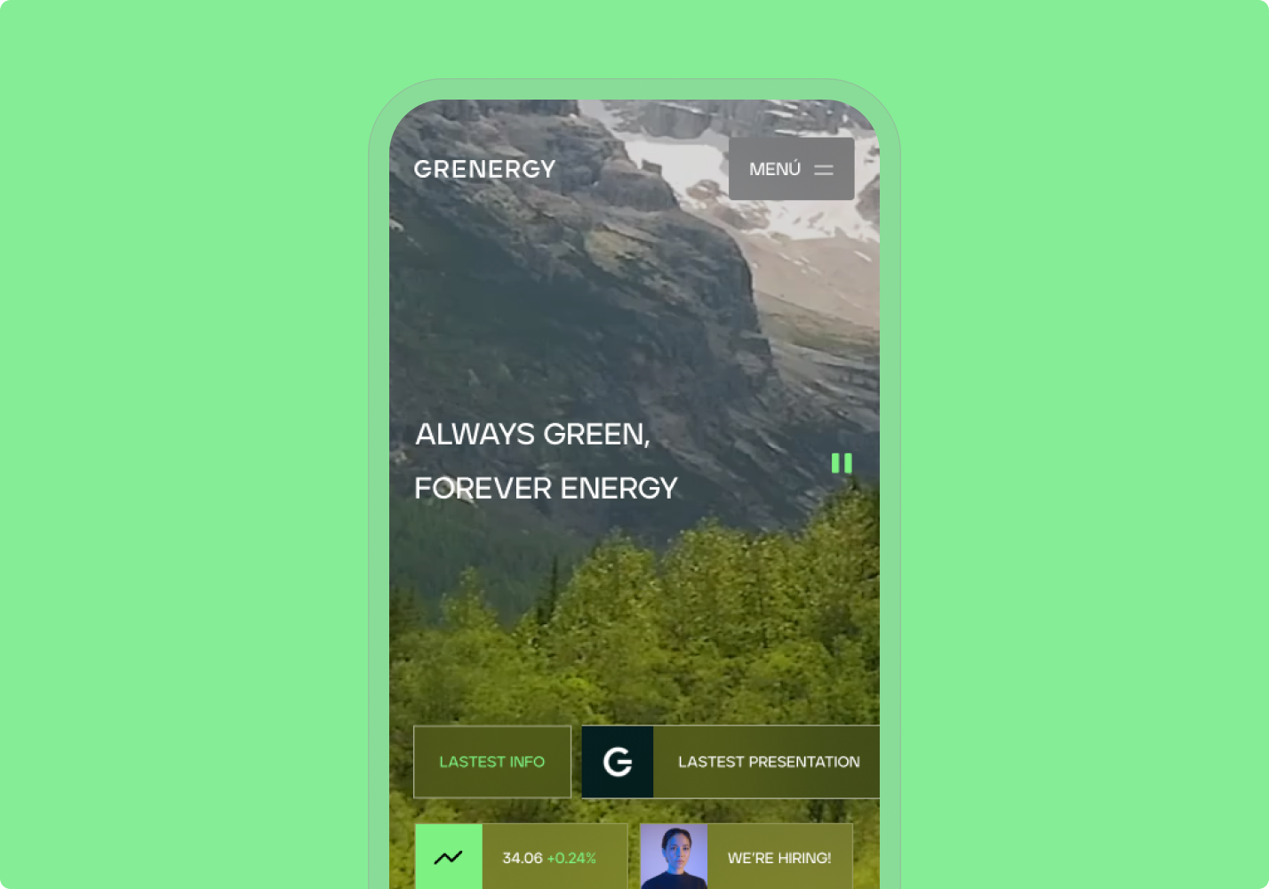
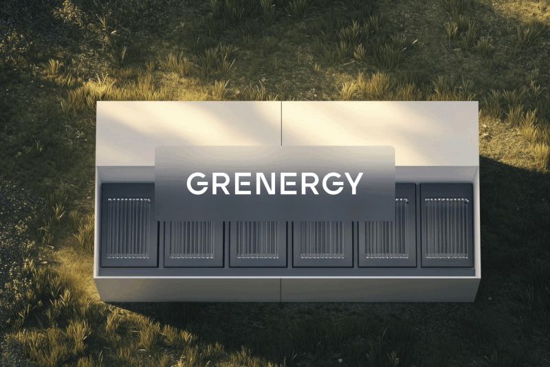
HomeHome
DRAG >

Grenergy

:five 

Strategy, 

Branding, 

Digital Product 

:arrowright 

Global 

Powering What’s Next: The Branding Behind Grenergy’s Growth

Grenergy

CAPABILITIES

Research & Analysis
Strategy
Visual identity
UX/UI design

Brief

Strategy

Strategy

imagen slider-0
imagen slider-1
imagen slider-2
imagen slider-3
imagen slider-4
imagen slider-5
imagen slider-6
imagen slider-7
imagen slider-8

Visual Concept

The visual language of the new Grenergy identity is inspired by the strategic concept revolving around chlorophyll, specifically the cells containing this green pigment so key to natural energy. The concept of these cells also ties in with the reality of the company’s activities, which range from solar cells for generating power to battery cells for long-term energy storage. Every aspect of the identity is born of combination of these cells with the green energy at the centre of the brand platform.

Logo

At the centre of the new Grenergy wordmark are four cells taken from the brand’s concept. These can be static or dynamic, charging and pulsing with energy in a way which mimics the battery technology powering the company’s offer. The logo can therefore be used on products as a status indicator, giving a unique usefulness to an otherwise solid wordmark, a solidity fit for an industry leader.

Visual System

The cells of the visual language sit at the core of the graphic system, with fine lines and blocks of content building a fresh visual system. The brand’s colour palette is inspired by Grenergy’s green credentials and the brand’s key spaces, from the natural landscapes in which they work to the impressive architecture of their offices. A modern yet approachable typeface sits at the heart of the brand’s messaging, with special type treatment within the system of cells in order to deliver key messages with the impact and energy that the brand deserves.

imagen slider-0
imagen slider-1
imagen slider-2
imagen slider-3
imagen slider-4

Visual Elements

Moving away from the illustrations of the previous identity, the new brand places photography front and centre, proudly displaying a variety of Grenergy’s grand projects in sweeping landscapes. For more technical uses, we simplified and unified the style of simple iconography and more complex illustrations for a coherency and elevated design language across the brand’s touchpoints. We also introduced simple, single-colour 3D models for special use cases, such as the introduction of new hardware and high-impact messaging.

imagen slider-0
imagen slider-1
imagen slider-0
imagen slider-1

Design System

All of the brand’s new elements come together to form a coherent, modern, and category-leading identity which aligns with Grenergy’s new brand platform and next stage of growth. The tools that the design system include allow for ease of application across existing touchpoints, new materials, and future projects that the company is currently working on.

Applications

For this first phase of implementation, we worked on a wide array of applications to launch the new Grenergy brand in early 2025. These introduce the vast array of visual elements from the design system and range from materials for a relaunch campaign to exclusive internal merchandise for Grenergy’s team members across the world.

imagen-0
imagen-0
imagen-0
imagen slider-0
imagen slider-1
imagen slider-0
imagen slider-1
imagen-0
Image left column
Image left column
Image left column
imagen slider-0
imagen slider-1
imagen slider-0
imagen slider-1
imagen-0

imagen-0
imagen-0
imagen-0
imagen slider-0
imagen slider-1
imagen slider-2
imagen slider-3

Enjoying this project?

imagen-0