

Eloy Gonzalo 27
28010 Madrid
Spain
Rue de Commerce 31
1000 Brussels
Belgium
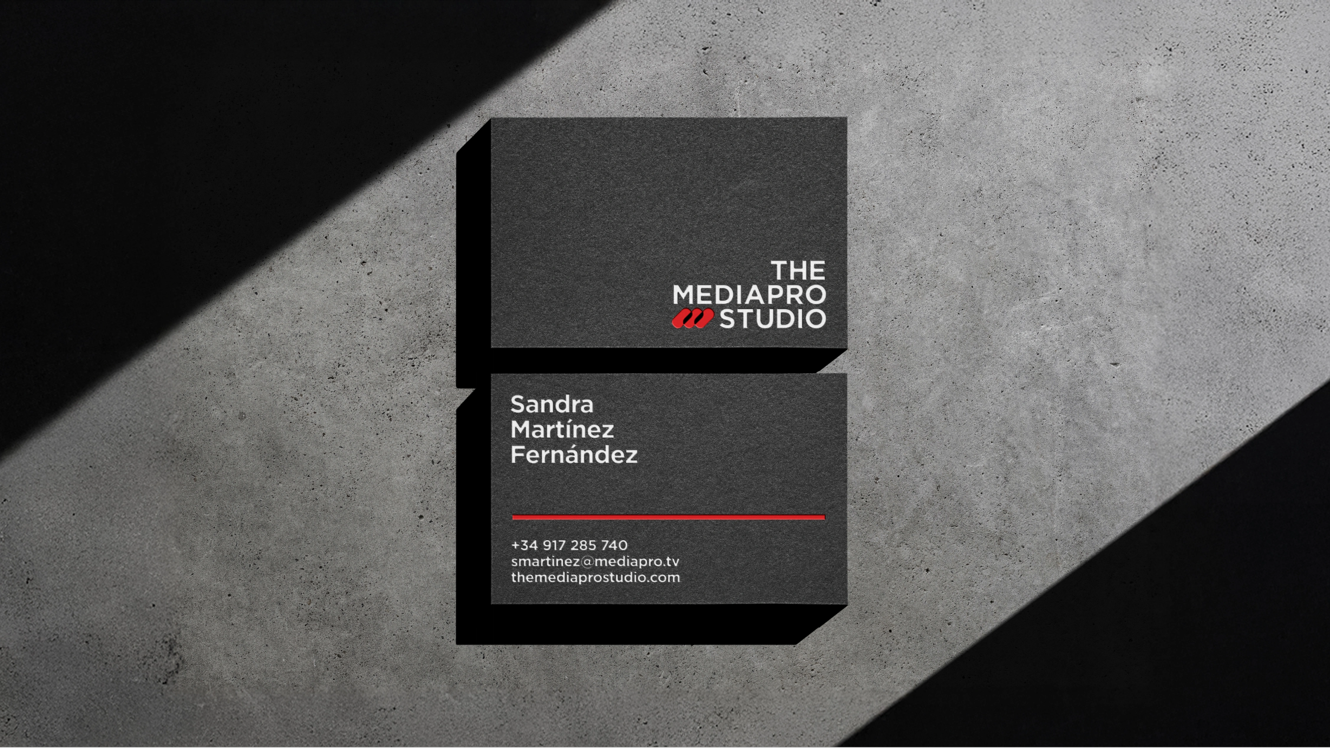
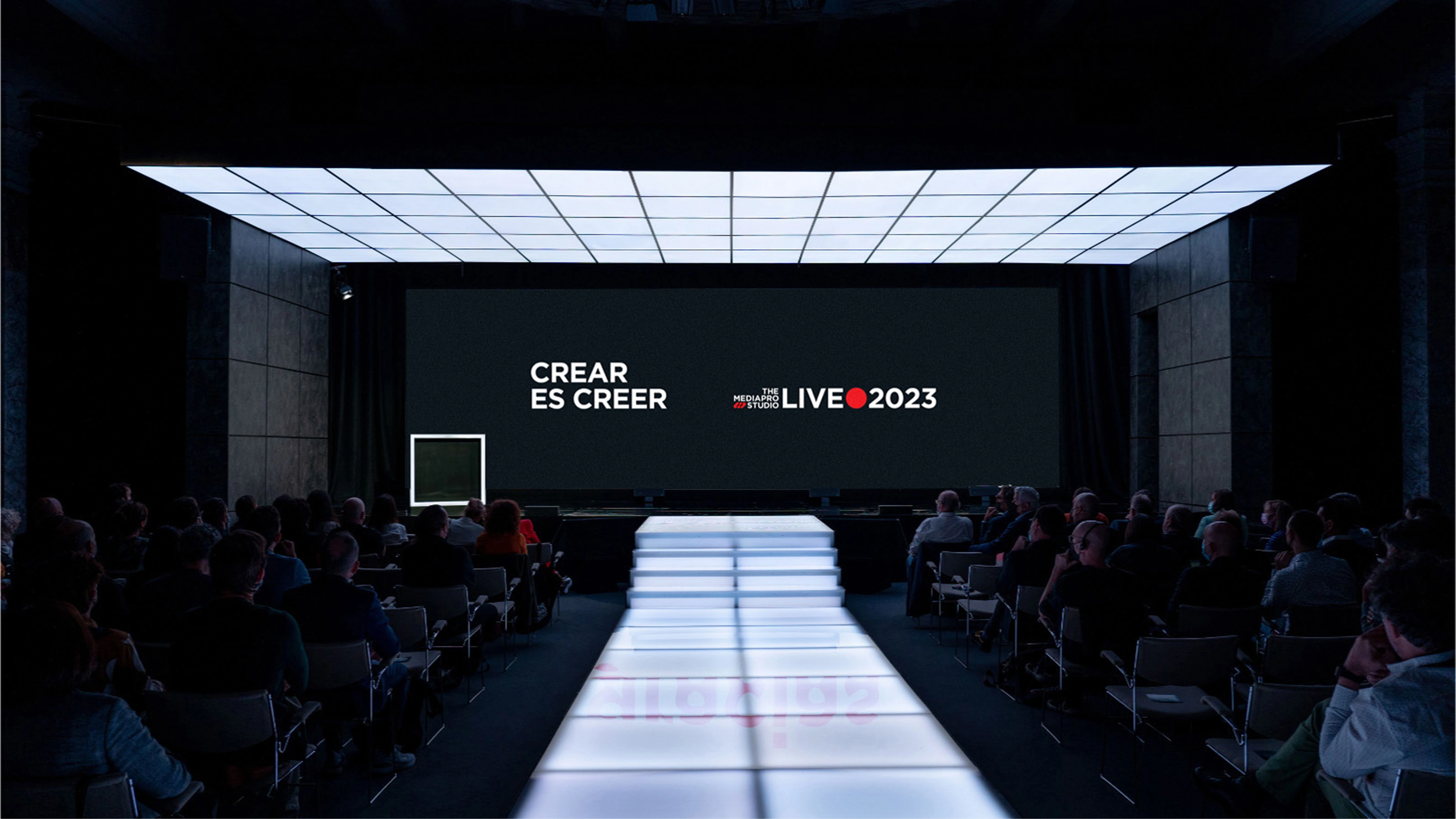
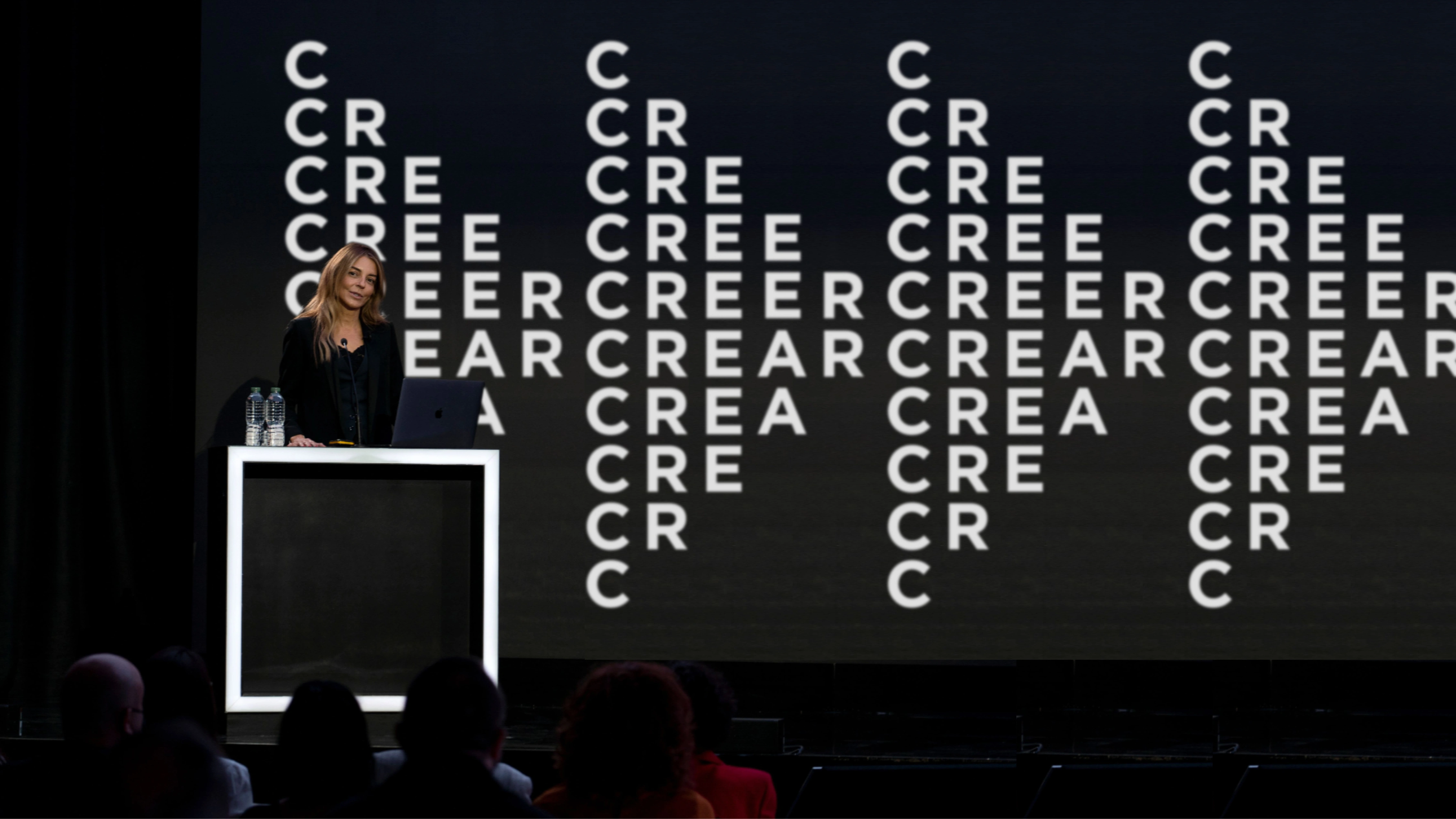
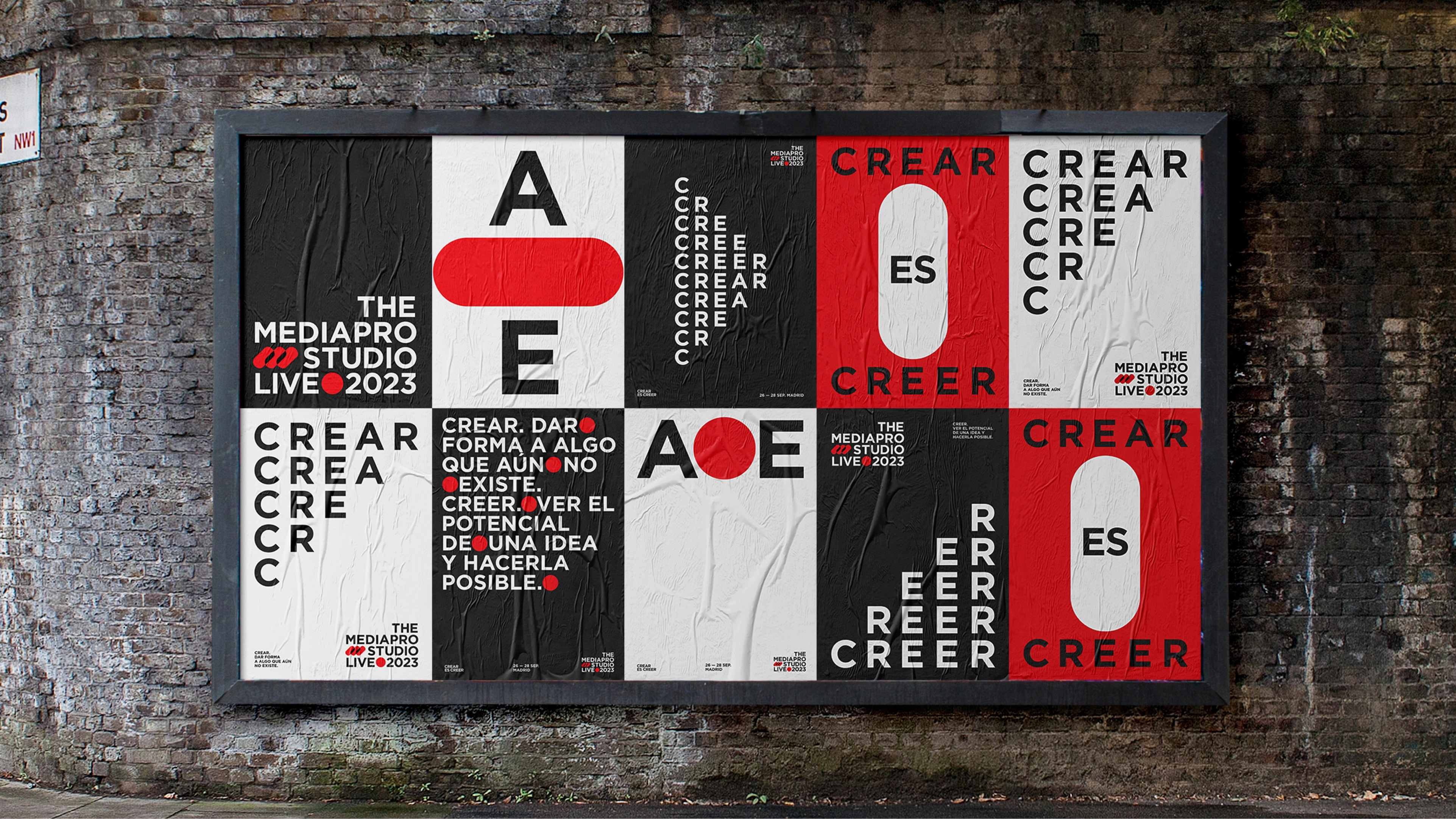
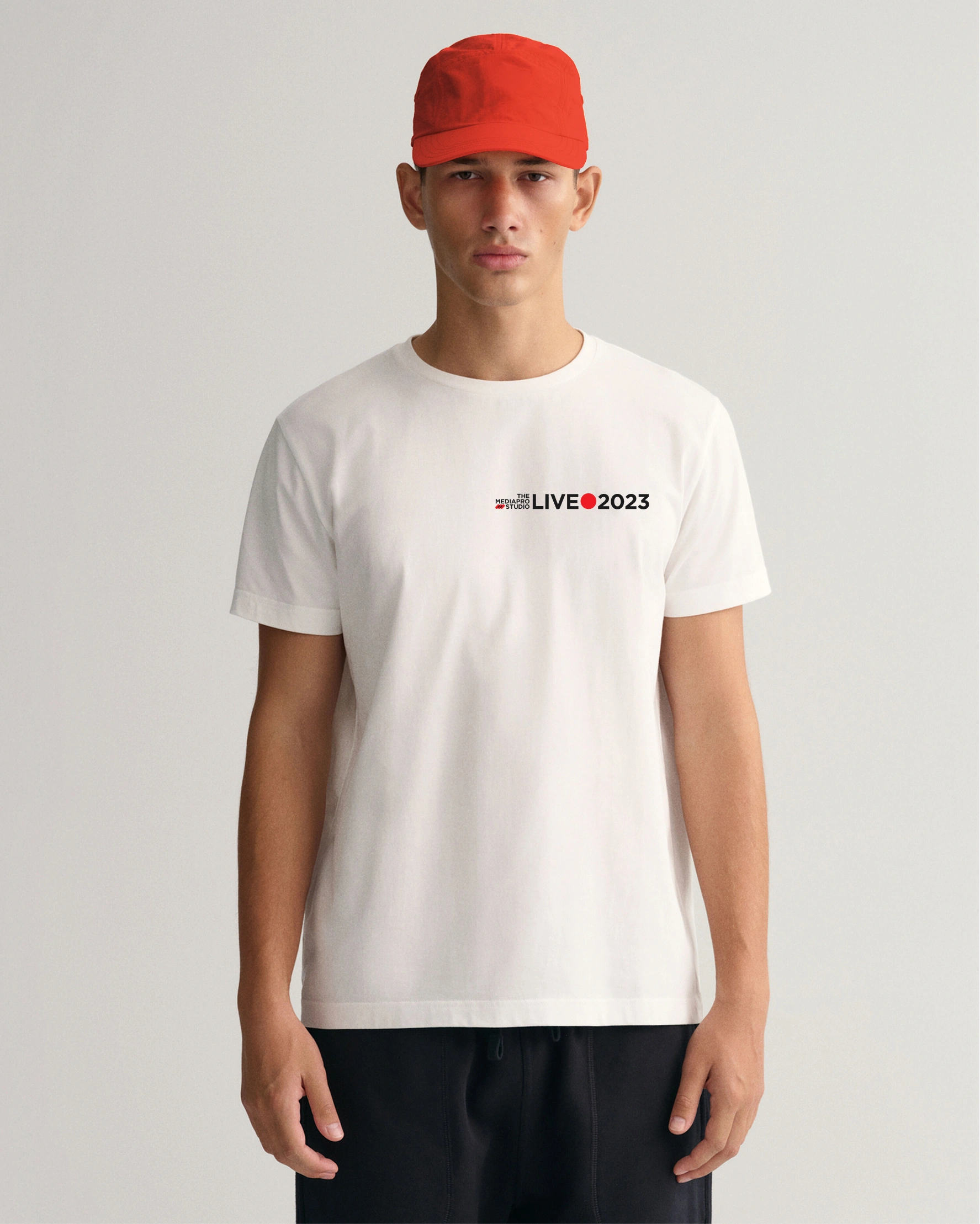
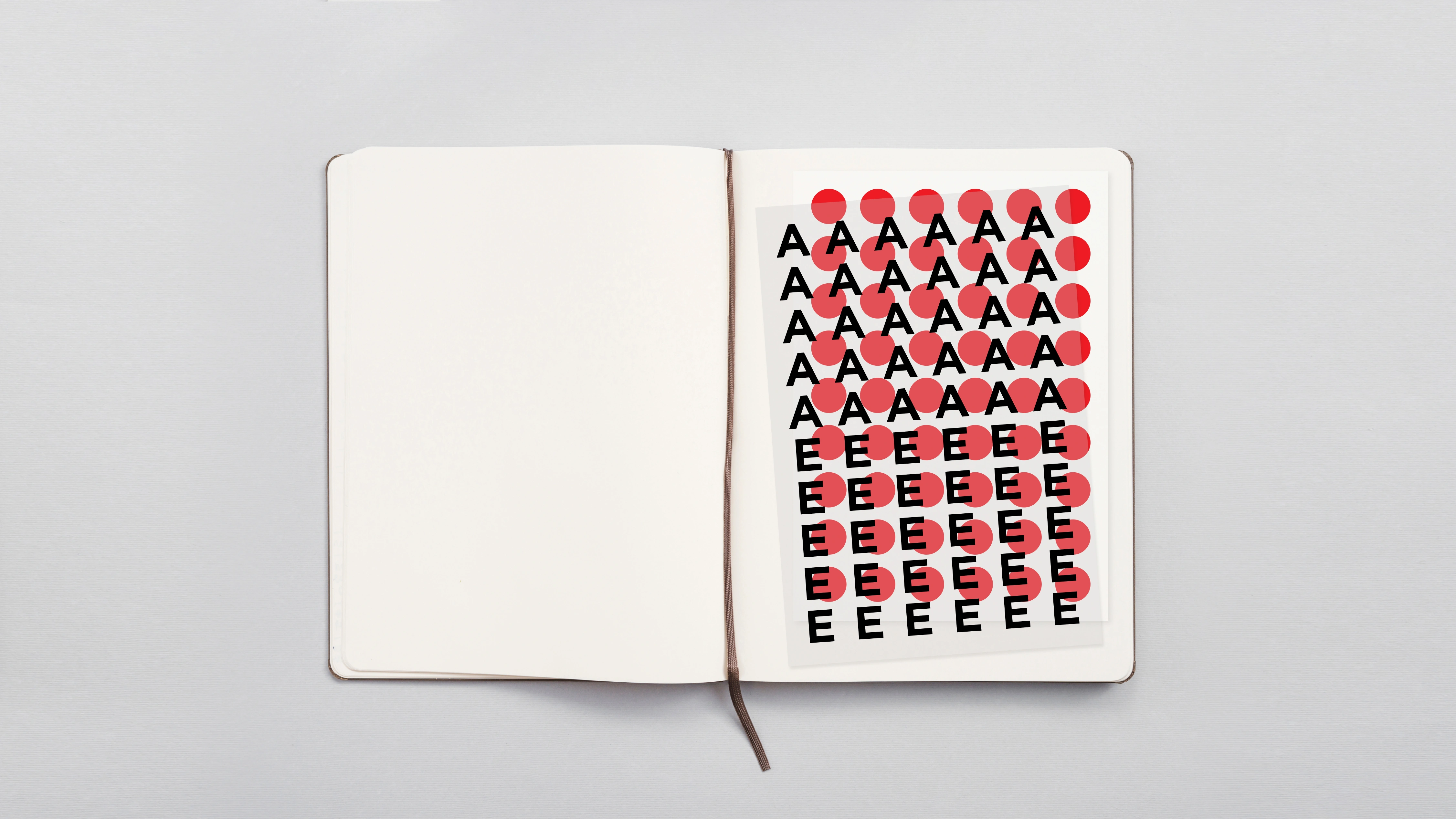
The strategy
We crafted a brand strategy and visual identity that reflects Mediapro’s scale and ambition. With a simplified brand architecture, refining the visual language, and building systems for content, distribution, and production that could flex across platforms and regions. We also aligned the brand across its studio, distribution arm, and international operations to ensure consistency.