HMY
Brand evolution and positioning for the international leader in retail projects as they diversify into other industries.
Brief
HMY is the leading international partner for retail projects, sitting on the cutting edge of innovation and sustainability. The company has a track record of more than 60 years, with a presence in over 160 countries, 90 commercial offices, and 13 production plants. Their 360° methodology which combines the brand’s global reach with local expertise allows them to create agile, scalable, and flexible solutions for a variety of retail sectors.
The main aim of the project was to evolve the brand and positioning to highlight HMY’s unique strengths, such as its glocality, integral approach, and proven innovation. The solution also had to enable the brand’s diversification into other industries at a global scale.
Strategy
Through comprehensive research, analysis, and a brand audit, we detected key sector trends and insights. Competitors were expressing a global approach through local development, end-to-end solutions, and positioning themselves as project partners rather than mere providers. Their customers, the retail brands, demand a high level of curation within their spaces and innovative solutions that connect with audiences. Finally, consumers and society in general seek retail environments which respond to their needs, provide convenience and comfort, facilitate interaction, and present tangible action regarding sustainability.
Merging market demands with HMY’s strengths, we developed a brand strategy based on the idea of “building life into spaces”, an expression of the concept of a joyous space which cares for people, the planet, and the connections between brands and their audiences. A space to interact and not only share products and services, but also a brand’s purpose.
Strategy
Visual Concept
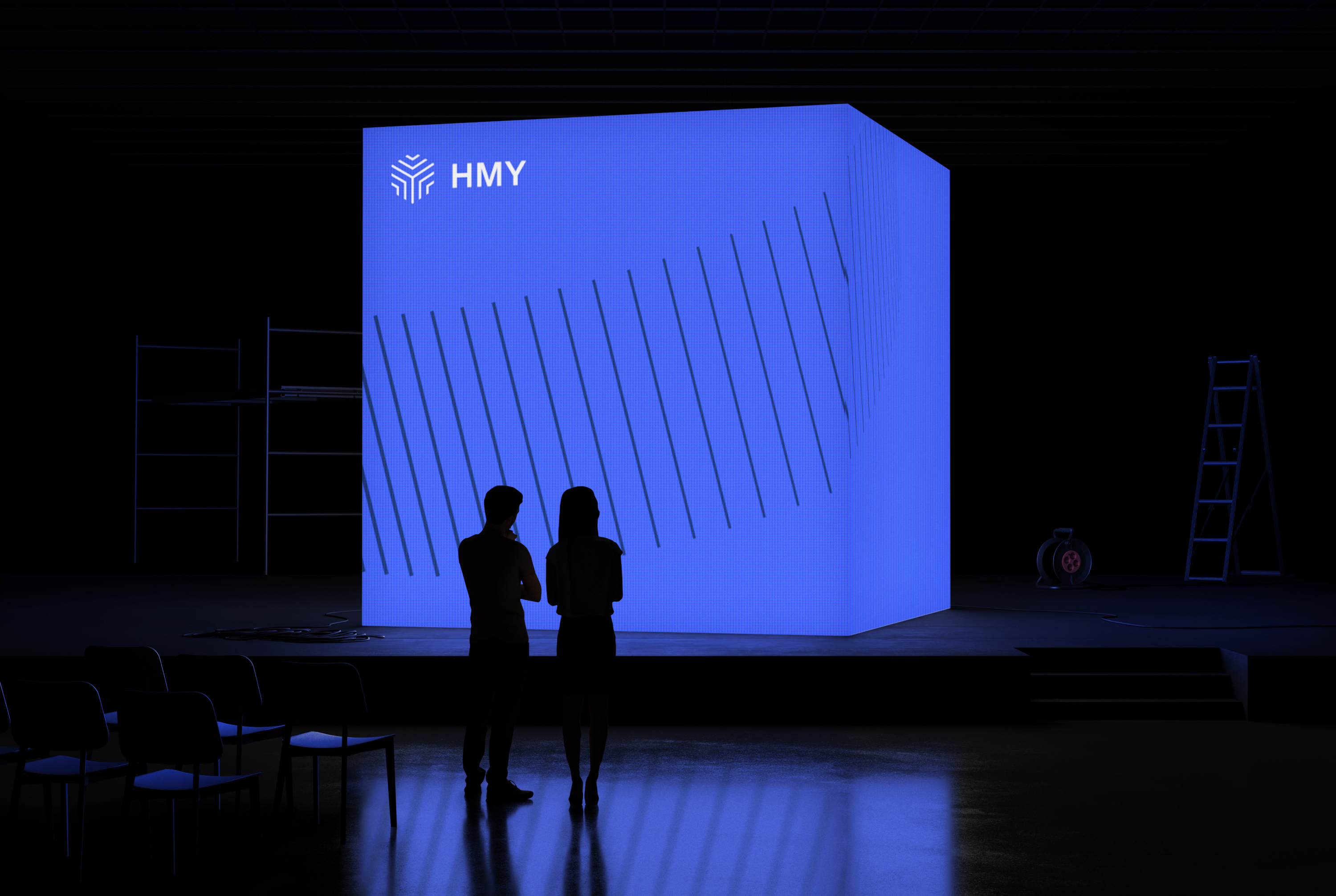
Combining the concepts of life and spaces, we developed a visual language representing an explosive expansion that creates physical spaces. The 2D lines of the visual system expand, contract, and shift around to create an infinite number of 3D forms.
Logo Approach
Crafting the logo for HMY was of utmost importance in this case due to both internal and external factors. Internally, the team was keen to have a unique and ownable symbol to reflect their position as sector leaders. Externally, the company’s opportunity to brand their work is often limited to a small and subtle application of their logo within the retail spaces they construct. We thus opted to develop a symbol-based logo which although bold and simple was full of symbolism and meaning.
Symbolism
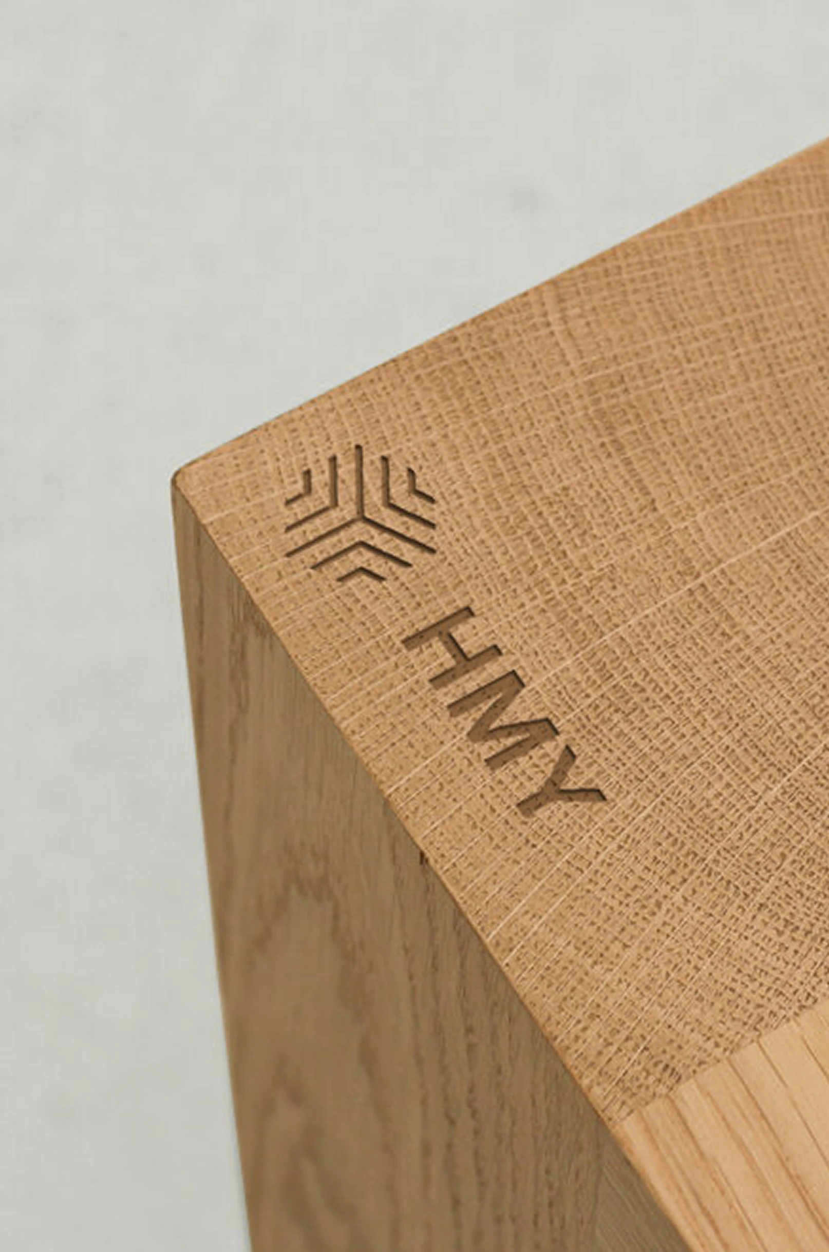
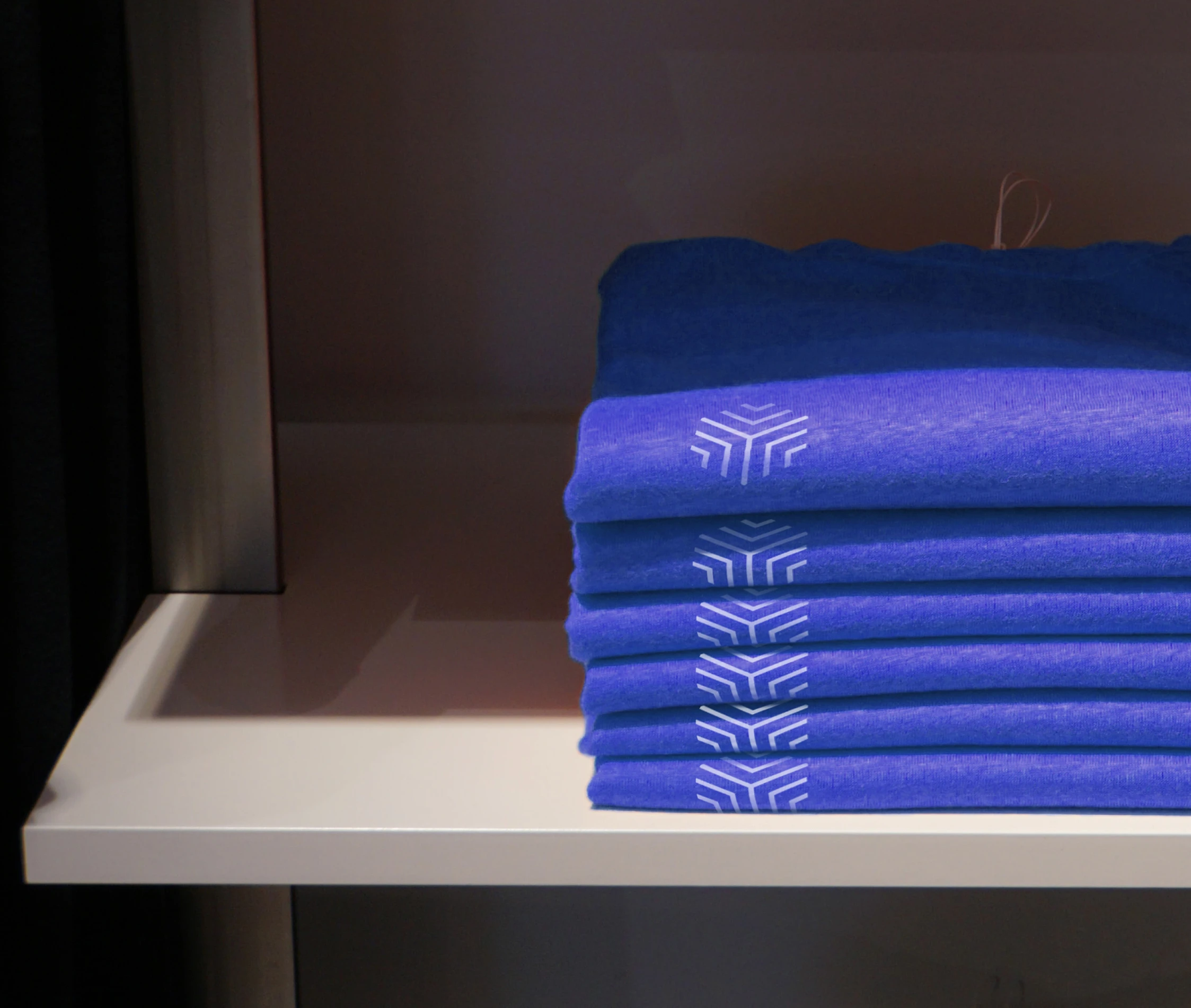
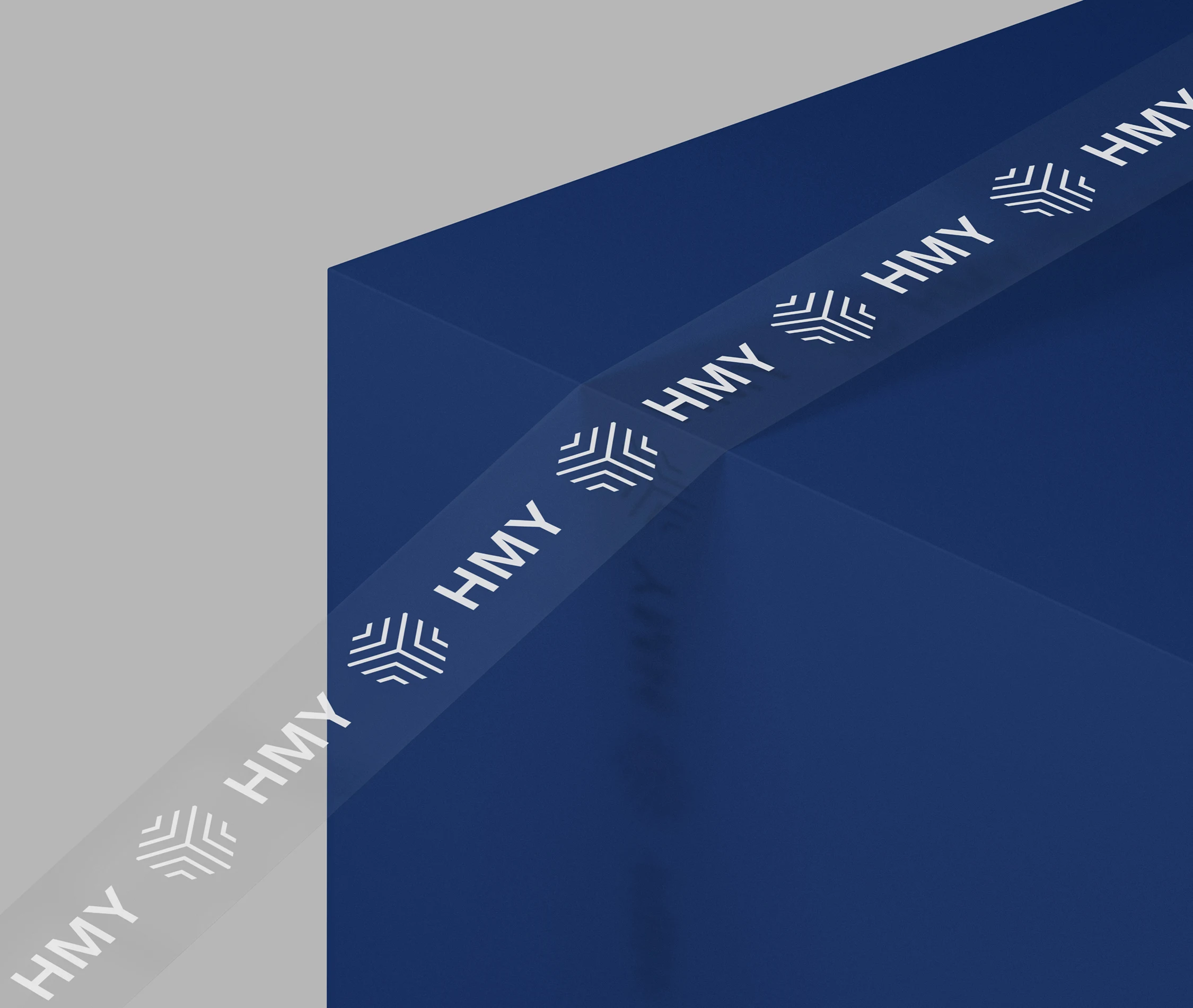
The symbol integrates three principal concepts. Firstly, it is based on the three axes of a physical space, forming a cube as a clear reference to the company’s activity. Secondly, it integrates a series of lines which create a sensation of radial expansion, in line with the concept of expansion. Thirdly, there’s a subtle reference to the letter ‘Y’, a cheeky nod to the company’s roots as Yudigar. The sum of these concepts forms a symbol which is also visually coherent with the principal visual resource.
Typography
Following the geometric and spatial nature of the visual language, the new brand typeface integrates pure forms and interesting and surprising shapes. This gives the brand a fresh and unique typographic voice which can be easily implemented across all points of contact, from the digital to the physical.
Colour
HMY has always been blue, as they own the colour within their field as the sector leader. Our approach sought to evolve the palette to create a more harmonious and impactful solution, one which would be ready to meet the needs of new challenges such as a complete digital design system.
Illustrations
Playing again with the concept of expansion, we developed a series of simple illustrations in line with the visual codes of the new brand. This simple system of geometric shapes allows for quick and easy development and implementation of a whole range of illustrations and icons to cover the brand’s varied needs on a global scale.
Graphic System
The lines of the brand’s texture are also present within its visual system, which uses vertical separators to organise content and as a photographic filter. This verticality is present throughout the visual identity as a constant motif which lends coherence to the brand, but its simplicity also leaves the door open for other interpretations and flexibility in the future.
Applications
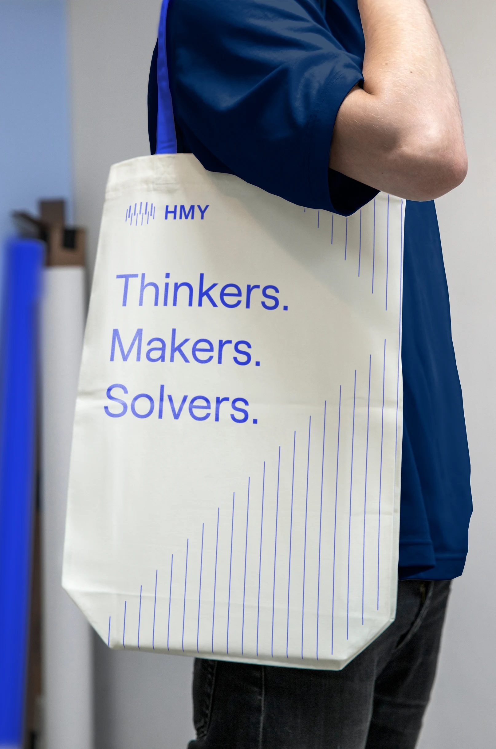
To experiment with the flexible coherence provided by the visual language we developed, we developed a wide range of branded applications. These ranged from mass external communications to unique internal merchandise, spanning all kinds of digital and physical touchpoints in between.
Website
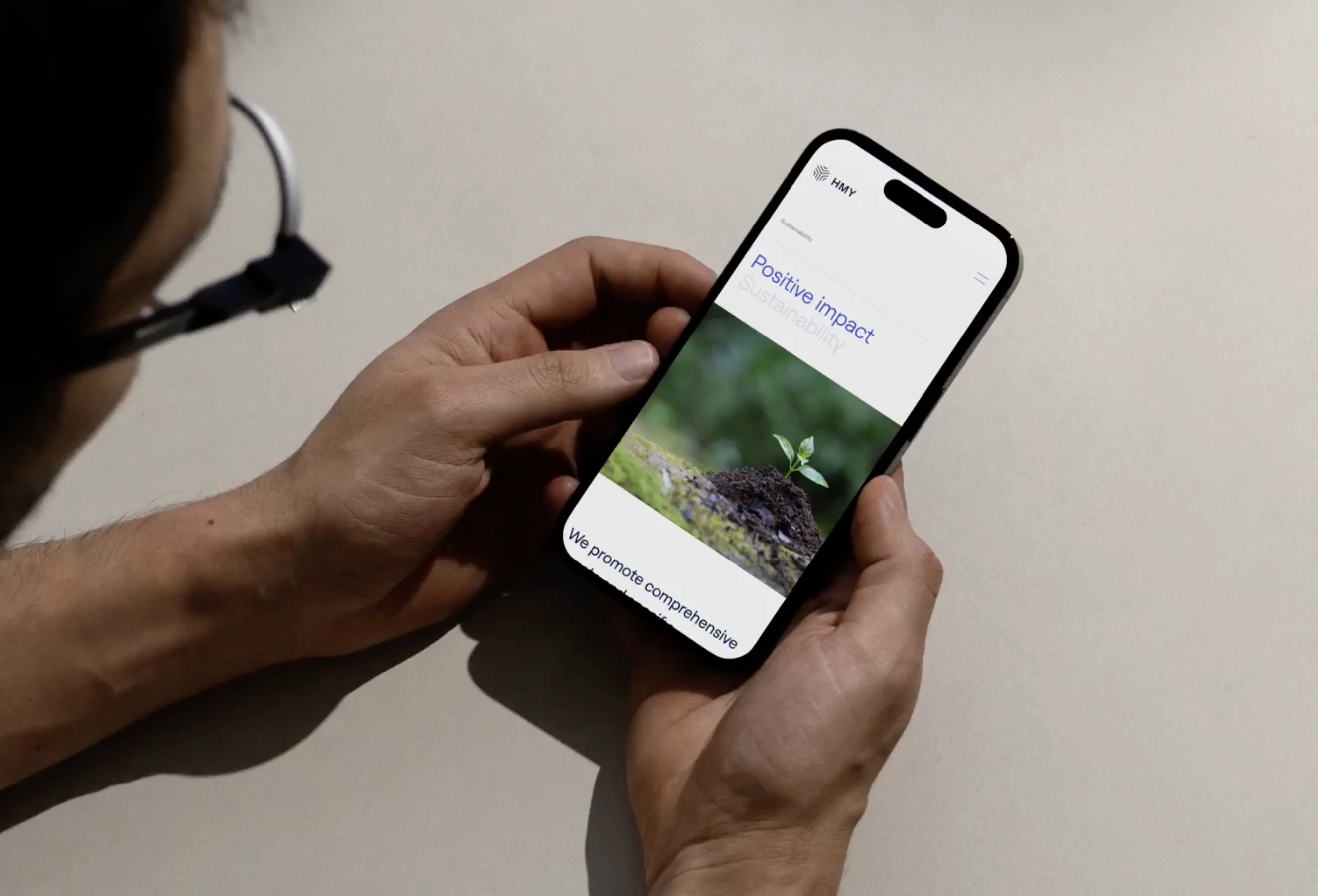
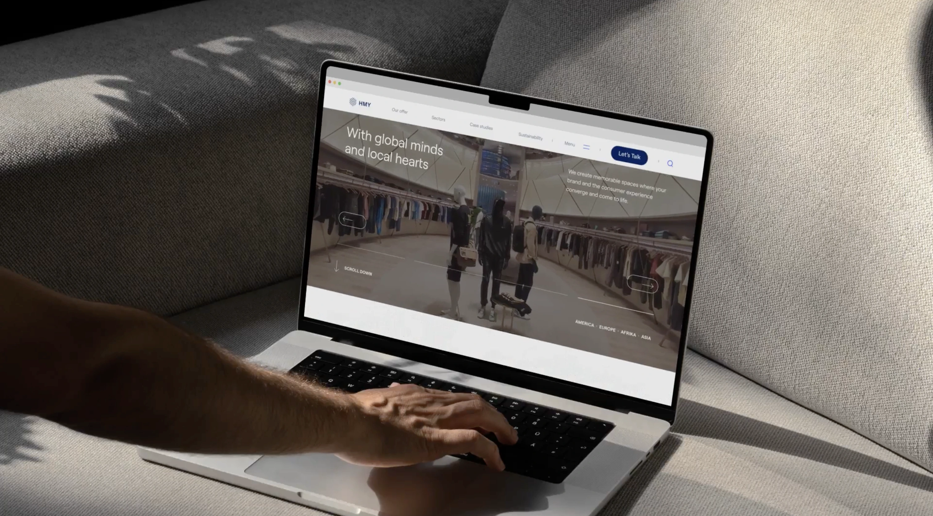
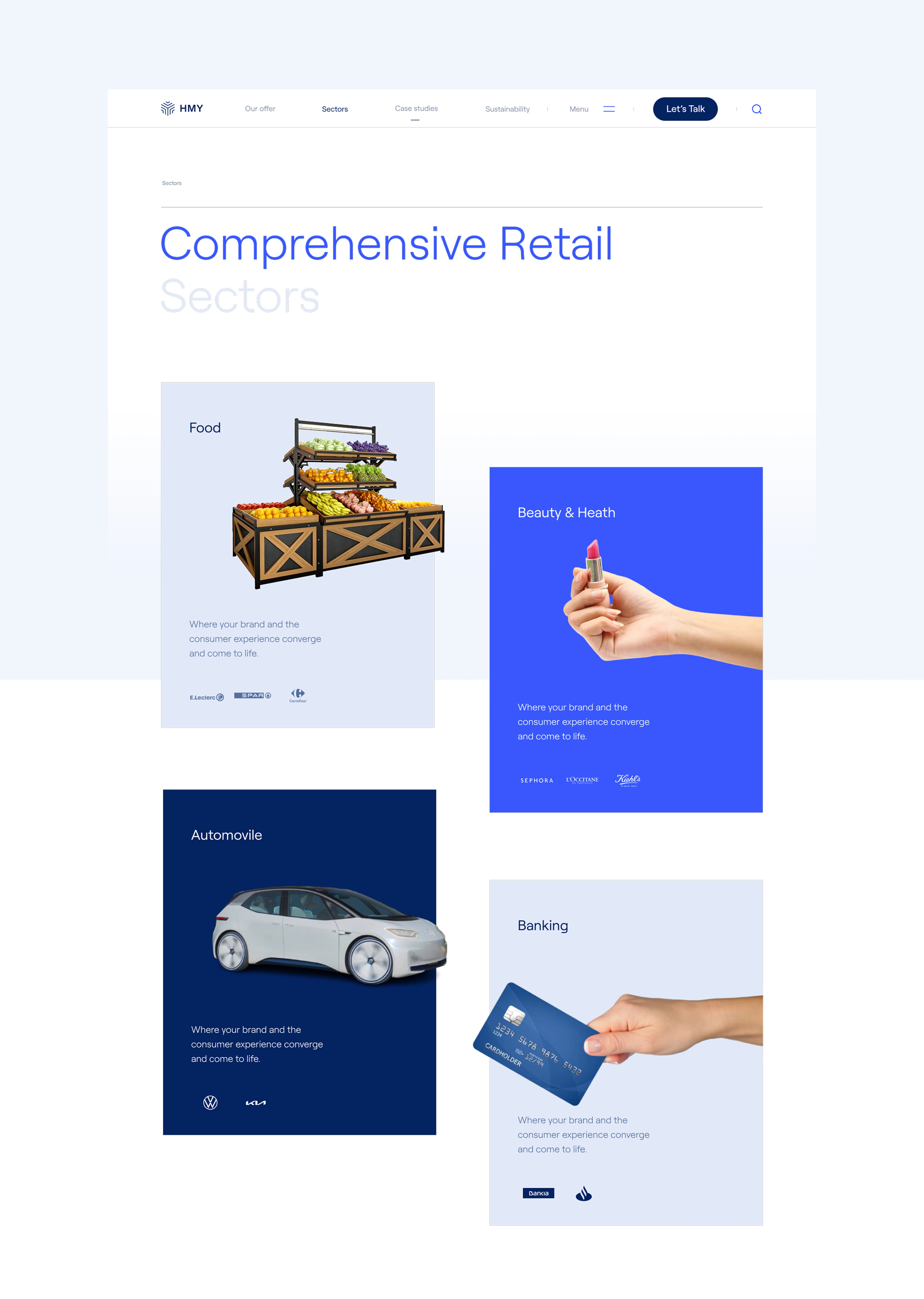
We also undertook a comprehensive project to reimagine HMY’s global website. We started from the ground up with a process of research, redefinition of the site’s structure, and complete visual overhaul including the development of an extensive digital design system.
Enjoying this project?
As a strategic brand, design, and digital consultancy, at Erretres we’ve developed international projects for sectors such as media, sports, tech, startups, tourism, travel, fashion, gastronomy, real estate, and hospitality.