Ulity
For this project we crafted the whole spirit for the new B2B Mobility as a Service (MaaS) company from Santander Consumer Finance, from the naming, to the brand strategy, the visual identity and the website. Under the idea of ‘We go your way’ which is the strong statement on the ambition and purpose of Ulity, we have built a brand setting its direction to build the future of mobility with an extra of adaptability, flexibility or sustainability.
OVERVIEW
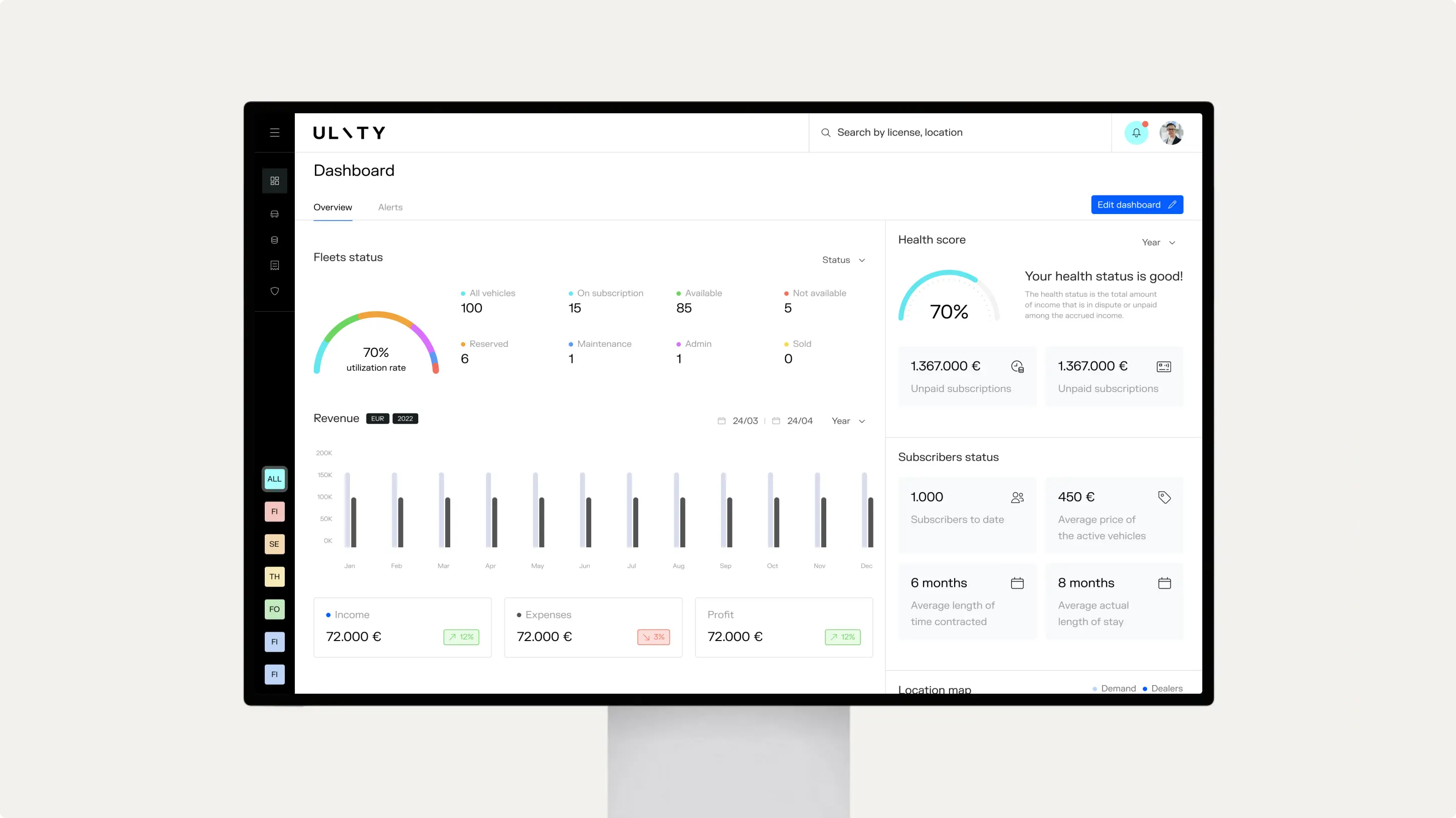
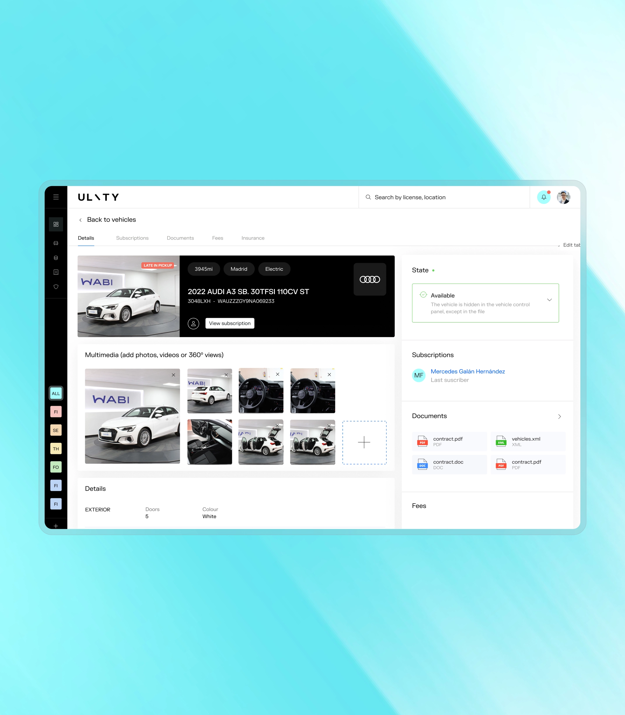
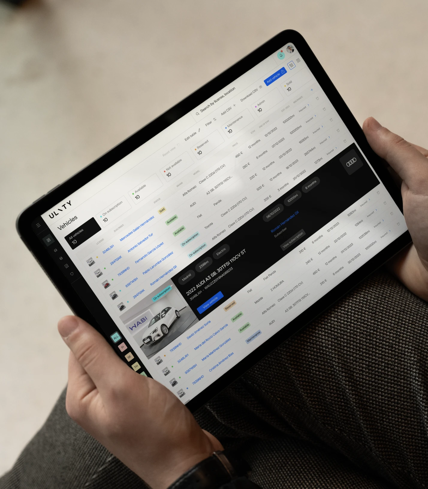
Ulity as we know it today is the B2B platform from Santander Consumer Finance, but before partnering with Erretres, it was just a brief with a promising product. With the goal of defining the future of mobility, Ulity is a company that features expert consultancy thanks to a team of highly skilled professionals with their own, adaptable, and scalable software. This platform allows all kinds of companies to develop their own mobility subscription solutions, no matter their nature or idiosyncrasy. With this standout idea of flexibility, we were asked to develop the whole brand, from the platform, to the name, to the visual identity, without forgetting the digital touchpoints such as the website.
CHALLENGE
Before starting to think about how we perceive the present and future of Ulity, we identified what the main challenge was: to both compete and collaborate within the same company. Keeping in mind the potential clients of Ulity, this was an important risk to be considered: to be partnering with companies (OEMs and ride hailing services) that also have different business models for mobility which compete with Ulity.
STRATEGY
With that insight in mind, and after a deep contextual analysis focussing on the likely competition that Ulity could face and other companies and trends that would inspire the project, we developed the brand platform rooted in the two attributes mentioned above. While the main asset here is the software and its adaptable and flexible nature, it was important to also qualify the professional expertise and the top-notch consultancy that’d identify the company.
We thus came up with the fundamental brand idea that would nurture the brand and its expression. This was “We go your way”, a verbalisation emphasising both the active accompaniment that Ulity will deliver to their partners and also the inherent nature of how Ulity adapts and evolves to the spirit of each company, allowing them to develop the mobility subscription models that they need, deserve, and reward.
ULITY
NAMING
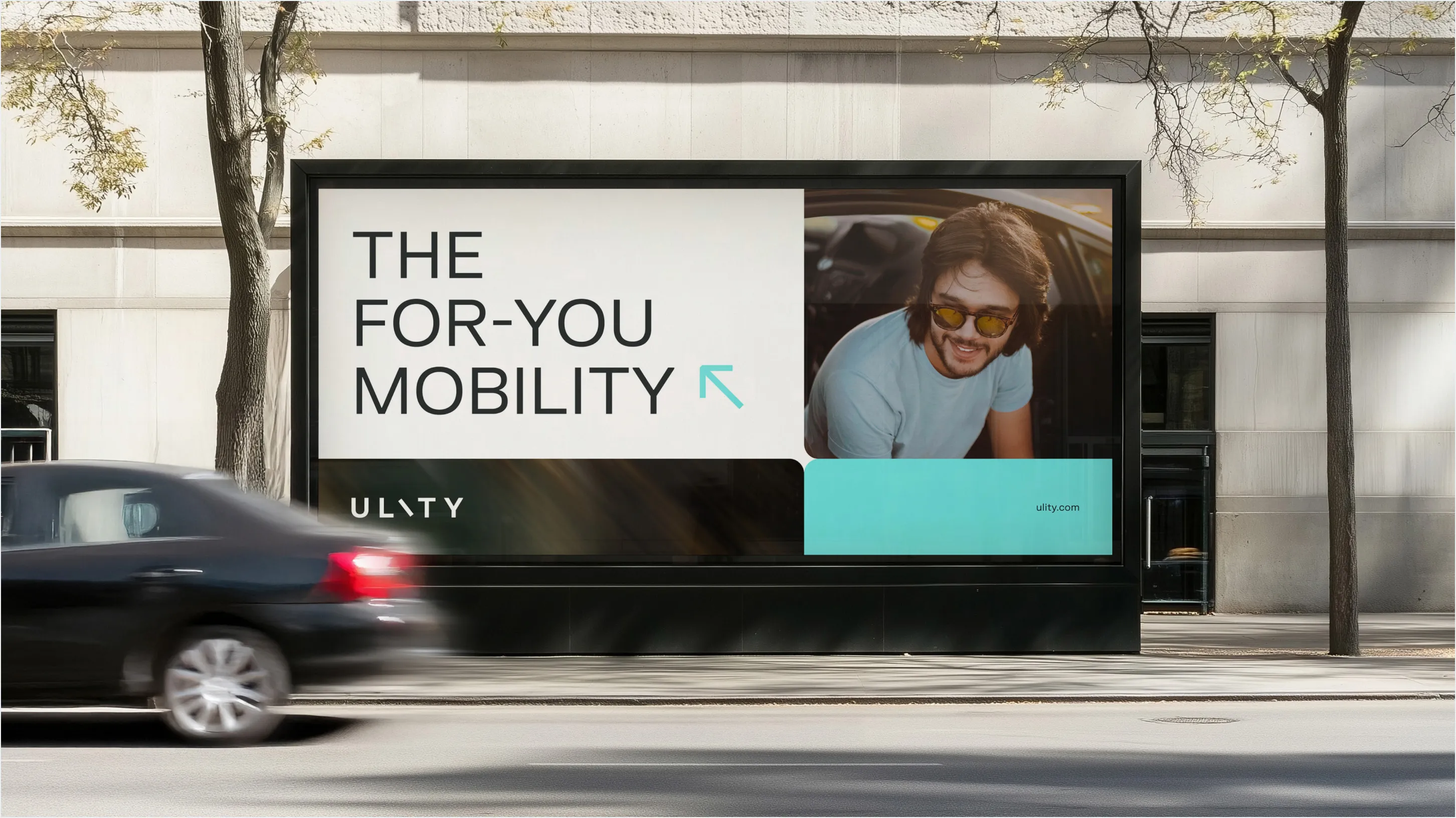
But Ulity didn’t have a name the first time we met, so we undertook research in order to find the denomination that’d fit it best. This involved more than 200 options, from Latin archaisms, to Japanese evocative words, passing through pop culture icons along the way, until we finally found it: Ulity, a concept that involved every feature we considered mandatory, such as adaptability, flexibility, utility or sustainability, with a special mention to mobility, the angular concept here. The mobility, that is for you, for your company, your employees, yourself, or your planet. The for-you-mobility. Ulity. Voilà.
VISUAL CONCEPT
We settled on a symbol to represent the duality of the creative concept, an object which represents the alignment of everyone involved to face in the same direction: the compass. Breaking the compass down into its component parts, the brand identity makes use of the rounded edges of the compass rose, an angled movement inspired by the rotating ring, and arrows and directions taken from the compass needle itself.
LOGO
The Ulity logo is the starting point for the rest of the identity, representing a compass in a most pure and typographic form. Across digital touchpoints, the Ulity logo is seen in movement, adding dynamism and aiding in the understanding of the nature of the rotation of the I.
COLOUR & TEXTURE
Ulity’s colour palette is energetic, with a nod to electric vehicles and nature itself via the use of an optimistic and energetic blue colour. The rest of the palette is optimised for digital use, with strong contrasts and warm greys to create a sensation of warmth to contrast with the principal colour. The texture is created by mixing blue and white in a movement which points in the same direction as the logo, reinforcing the concept of a unified direction.
Iconography & Illustration
We also developed a series of custom illustrations, which allows the brand to easily create illustrative iconography, illustrations, and even highlight interesting figures. This angular movement follows the same alignment as the rest of the brand’s elements, and small details within the illustrated numbers are included as a nod to vehicles and mobility.
Enjoying this project?
As a strategic brand, design, and digital consultancy, at Erretres we’ve developed international projects for sectors such as media, sports, tech, startups, tourism, travel, fashion, gastronomy, real estate, and hospitality.
Applications & Communication
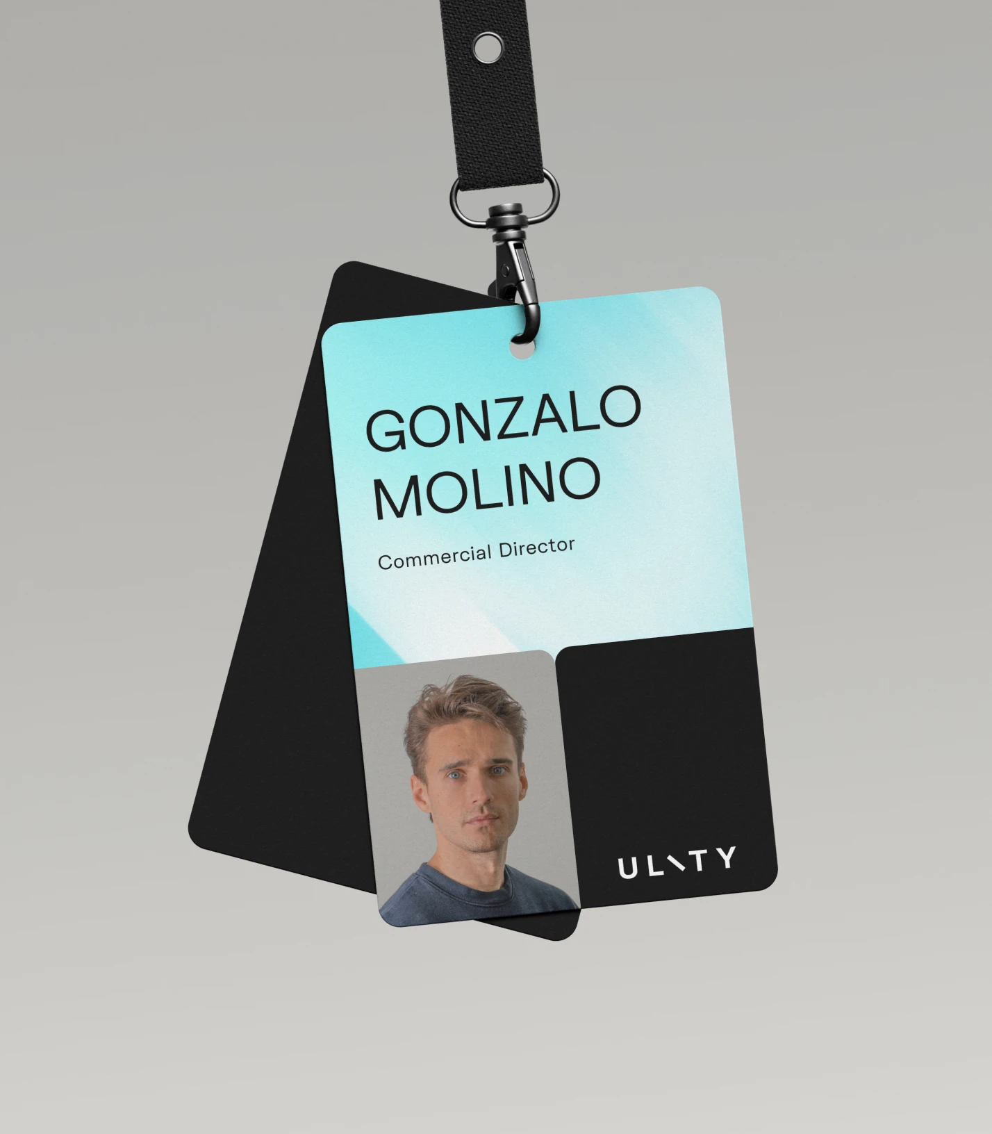
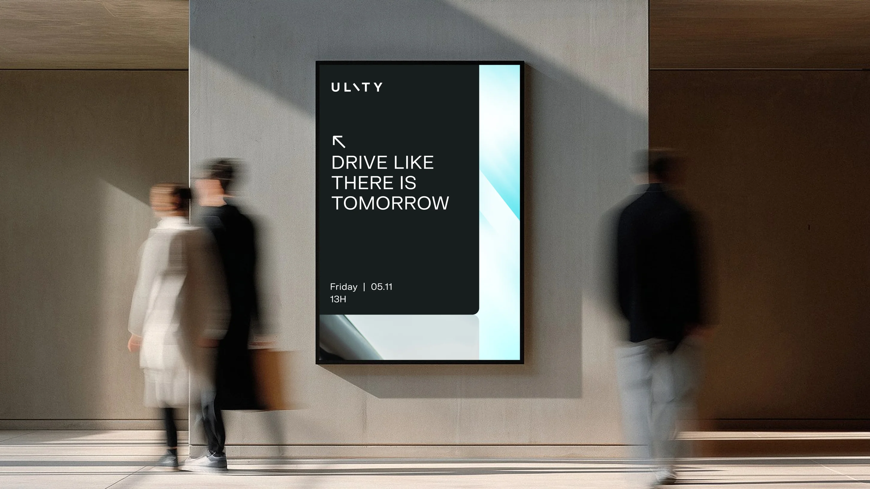
We applied this extensive graphic system to an array of different touchpoints, both necessary present applications as well as possible future ones. Even with the branding project wrapped up, we continue to work with Ulity on conceptualising, defining, and producing a wealth of branded communication materials across various platforms and for a wide variety of events.